Ensuring patient safety in the rapidly evolving digital systems is an essential principle in building healthcare applications. Through friendlier user experience and non cluttered user interfaces, a design system can contribute to reducing risks, errors, and harm.
What are the challenges
Working in healthcare means there are a lot of safety requirements to be met. However, as designers we are always mindful of our users, the care teams, and their cognitive overload. So we are careful to comply with the safety specifications, while making sure following them doesn’t interfere with the user experience.
To put it simply, we are cautious not to overburden users with non-critical alerts and legal notices on every step of their workflow.
We also have to keep in mind that what worked on paper just fine, doesn’t work on screens. This new medium, the digital screen, has different rules of how we deliver crucial information.
Why cluttered screens are unsafe
In an effort to ensure the most comprehensive overview of the patient’s state and display as much data as possible, EHR systems can go overboard with cramming too much information in one place, leading to confusion and overload of our working memory.
Although screen and paper are a very different medium, certain principles that are true for printed layouts should still be used for layout building for screens. For example, the way we group similar elements, recognize patterns, and simplify complex images when perceiving objects, are all applicable.
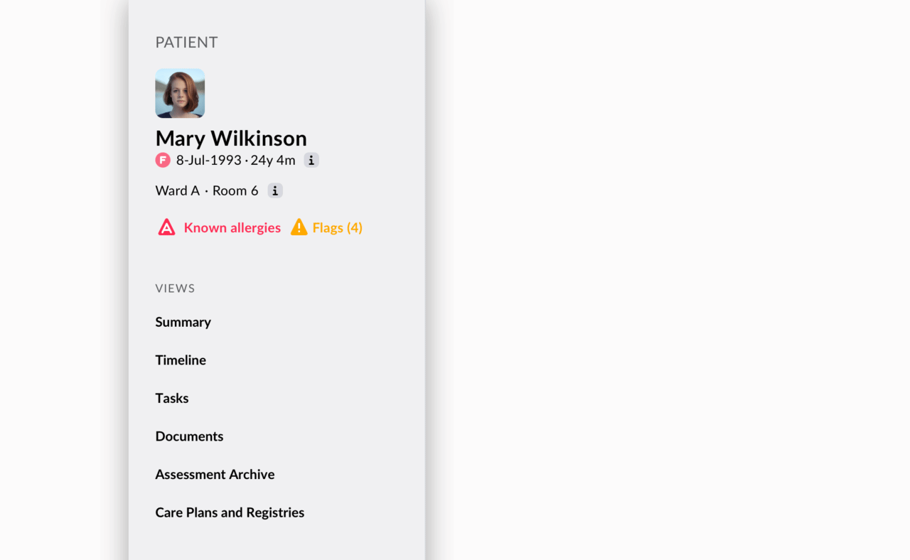
Layering and grouping of patient data in a patient banner. In-depth information about the patient is just a click away.
What we’ve done so far
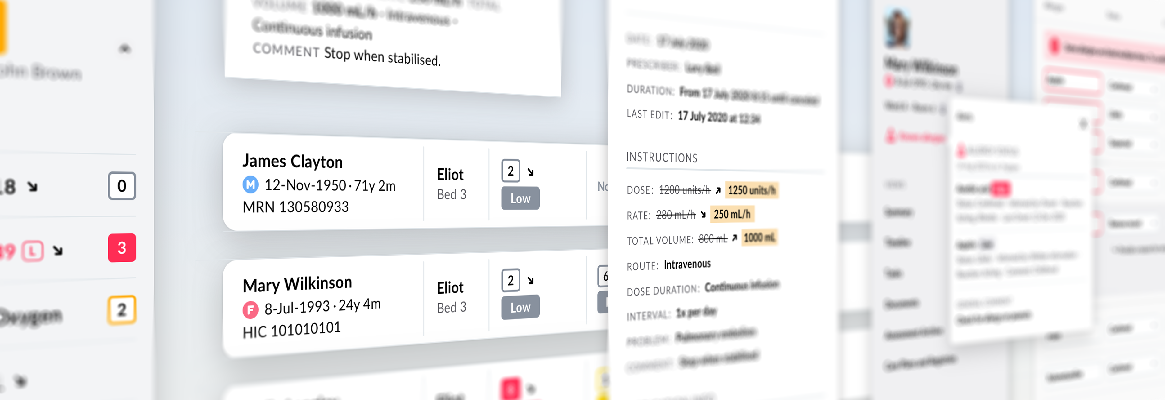
Smarter system of notifications and alerts
Alerts aim to be helpful and life saving, however, too many of them and all of them with the same level of urgency can lead to fatigue and burnout among healthcare professionals.
That is why we developed a system of notifications that separates system alerts, such as notification on upgrades, maintenance and outages, from the alerts that are patient-related. We defined a distinguishable pattern for each of these alerts and — because not all are equally important — a gradation of urgency.
A clear distinction of what is urgent and what can be attended to later is crucial. Our color coding and use of icons communicate the level of urgency across the system.
Also, as a side note, we are not fans of an excessive use of modal alerts, so we use them sparingly.
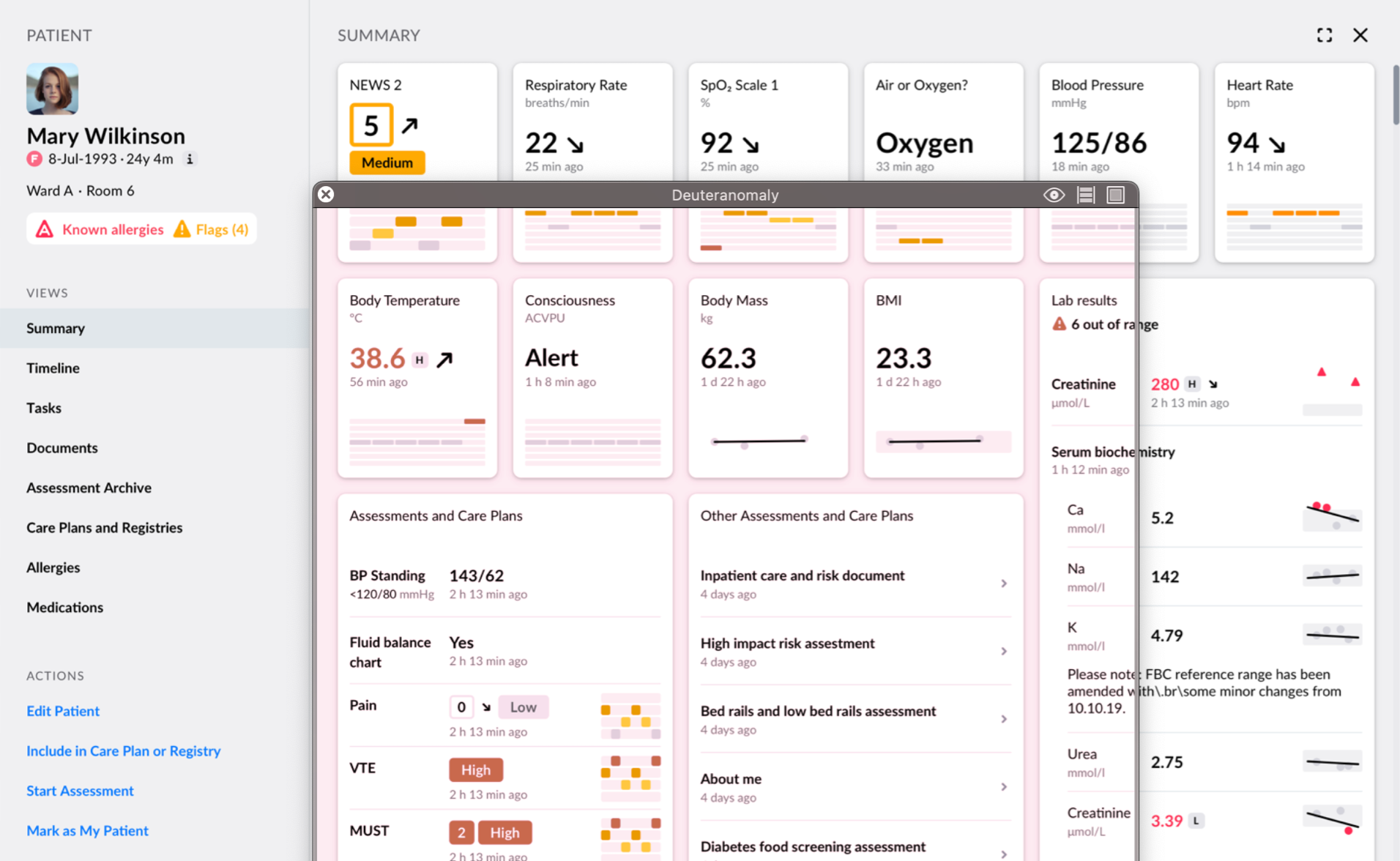
Our colour coding for clinical data is tested for the most common colour blindness with tools like Sim/Daltonism.
Colour coding for simplification
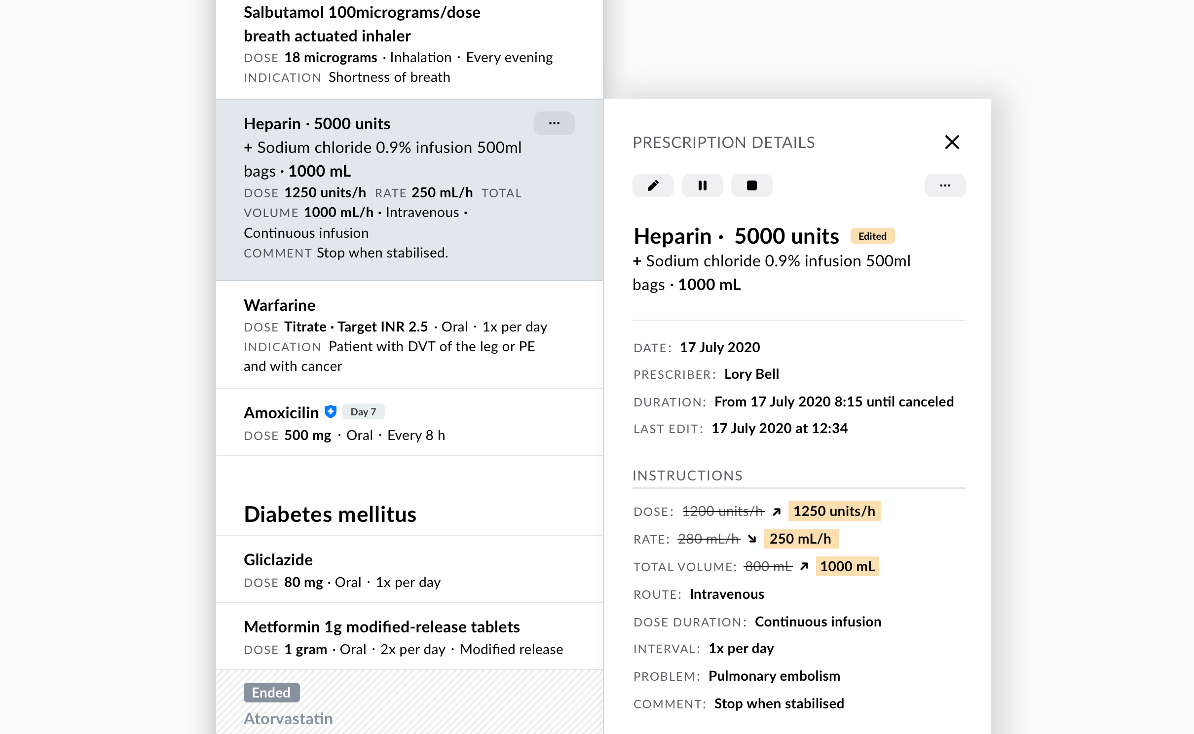
To make clinical data easier to read, we are striving to simplify visualizations and graphs so that they only show what is really important. We really try to keep the first level of data visualization clean, but with a click or a hover, users can always get more details on demand.
Unifying multiple color coding approaches for clinical scoring and scales tools used on paper was a big step. Our system now uses the same 4 colors for interpretation of stratification stages in all clinical scoring and scales used in our applications. Each of the four colors consistently communicates the stage of risk or state that the patient is currently in across myriad screening and scaling tools.
Visualization of trends is emphasized in our line graphs, sparklines and trends arrows. They make reading of values deviations fast and clear. Users can get a glance of what is going on with the patient with just "scanning" of the visualization in the matter of seconds.
Accessible colour palettes
Colour blindness affects around 8% of the population, the most common form being so called deuteranomaly, which is the inability to clearly distinguish red from green. Working in healthcare, we aim to build an accessible design system, inclusive to the needs of our users. Therefore, our color palette is colourblind-friendly — we avoid combining red and green and work mostly with blue and red (and orange and yellow as secondary colours).
For other, rarer forms of colour blindness, we plan to introduce theming, which would allow users to customize and engage with an interface in a way that best fits their needs.
Clear language
For complex digital products it’s vital to communicate in a clear and precise way, that’s also human and easy to scan. We don’t want to leave our users confused and stranded with unclear and technical jargon or burden them with unnecessary information.
While a lot of clarity is achieved with the proper use of typography and white space, this is not enough: information hierarchy and clear language contribute to a safer user experience.
Therefore, it’s not just about readability and the letters being large enough — it’s about the information hierarchy and respecting patterns we are used to from engaging with other digital products, especially when it comes to those dreaded negative scenarios.
Read more about it in our post on Why a content style guide needs to be part of the design system.
What’s in the works
When designing interfaces for hospitals, we do not always have an insight into what kind of devices are being used on the premises. An older computer screen can significantly change the look and feel of the application, which can become a safety issue.
However, this doesn’t mean that we should focus only on making robust, unfriendly interfaces. Certain modifications in colour, size, contrast, and other accessibility features can be done with themes that cover specific scenarios.
We are exploring the use of theming for different contexts: the use of high contrast theme for older displays and dark mode theme for night shifts. Theming could also tackle visual impairment adjustments, such as rare forms of colour blindness.
High contrast theme
We designers are used to working on high-fidelity and retina screens, but hospitals do not always have this option.
A high contrast theme is tackling the issue of older and low contrast monitors and other screens. While our basic colours stay the same, the whole interface gets modifications, such as more contrast in gray colors, a thicker line, very obvious selection states, additional safety features and optimized fonts.
Dark mode theme
Although dark mode might seem as more of an user interface trend, it can have an applicable value in healthcare applications. While the jury is still out on the effectiveness, we believe it could help reduce eye strain during night shifts or just working in low-light environments.
Patient-facing adjustments
Our main users are care teams, but mostly through patient-facing forms, the patients also come in contact with our apps.
User experience for a patient is not the same as for a nurse who fills the same forms every day, therefore the experience should be adjusted and help support first-time users of all ages and digital literacy.
For this reason, we are preparing a patient-facing mode with accessibility options, simplified flows, clear steps, very human language, a welcome page and exit page, and other helpers to reassure patients that they are successful in filling out the form.
Safety on our minds
The design system for healthcare has to be built for safety, but not in a way that compromises the user experience and leads to alert fatigue. It can’t all be a blinking red mess, even though we are dealing with life. We have to get smarter, improve hierarchy of information, of urgency, and be context aware while building products for better care.
Related posts
This article is part of a series on our design system. Join us on the journey of creating Better design system — with significant improvements we achieved and some wrong turns we had to take to get there.
-
Read the first blog in the series: Building a design system for digital solutions in healthcare
-
Read the second blog: How we used our design system and low code building tool for long term clinical data collection and visualisation
- Read the third blog: Why a content style guide needs to be part of the design system