medication management
When we standardise language and make it reusable and easy to reproduce by nonwriters, it doesn’t mean our products will end up sounding like robots. On the contrary, simple, human, but still professional is easy to copy — with the right guide.
From robotic to human experience
Before the digital age, only humans used language to communicate. So, when someone — or something, let’s say an interface — addresses us using language, our brain immediately responds to the other party as if they were human (for more see the book The Man Who Lied to His Laptop by Professor Clifford Nass of Stanford University).
Language is what makes interfaces more human-like. Words on the screen engage us, call us to action, and create an emotional connection. But for this magic to happen, the interface needs to conform to some social conventions and most of all feel natural and authentic.
To be able to scale this human connection in digital products, you need a content style guide.
What is a content style guide?
A content style guide is a set of guidelines and rules that bring consistency to your communication. It ensures that regardless of who is writing the content, the company or product will always sound like you.
It might include editorial guidelines for writing articles as well as guidelines for the smallest interface components, such as a button, and everything in between. Because even the most thought-out design is no good if the content is poorly written.
A content style guide shouldn’t be isolated documentation, but rather an integral part of a design system. The benefits of having one are therefore similar to those of a design system. Users will enjoy a higher level of consistency, which builds trust and relationships, while designers, developers, and writers will work faster with more confidence.
Date and time are an important part of EHR Systems. Above you can see inconsistencies in how dates were written in our applications.
Starting small
For now, we have one UX writer in our design system team, so Better content style guide is built slowly but steadily. We also didn’t start building it from zero. We looked at existing style guides and used that as our base, adapting it along the way.
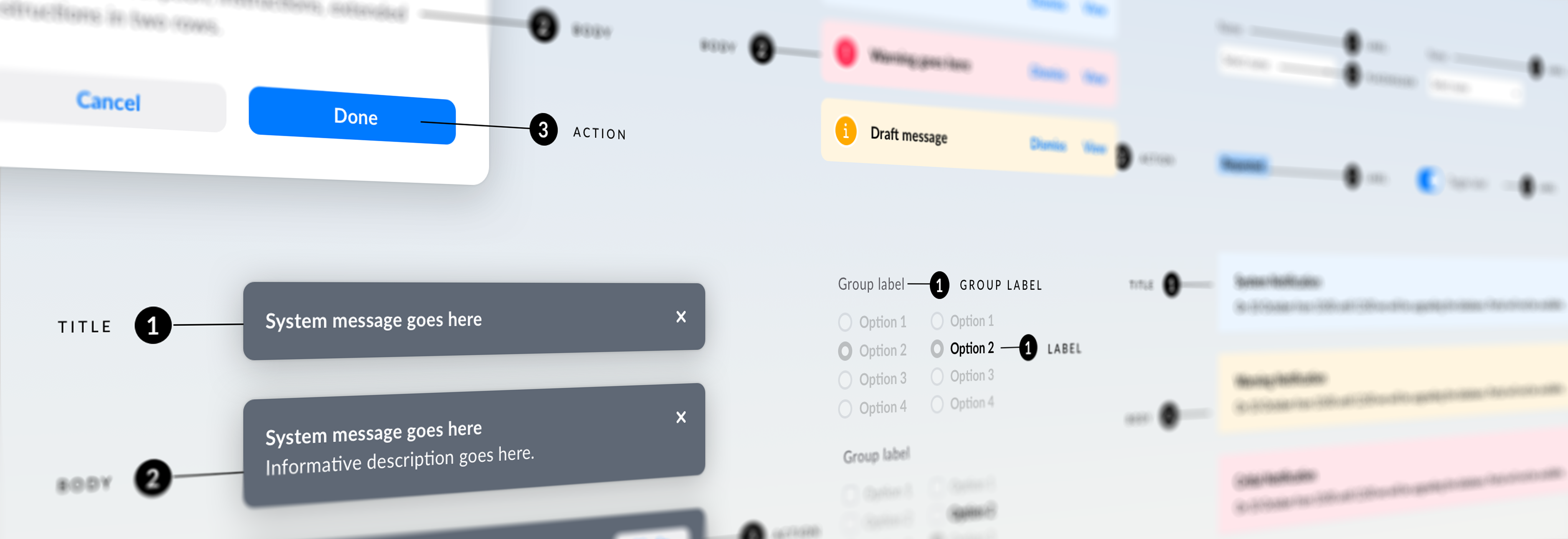
While we are laying down the ground rules, such as voice and tone, basic grammar, and writing style, we are also tackling content guidelines for components — if we’re already defining what a button looks like, we should also define what that button can say.
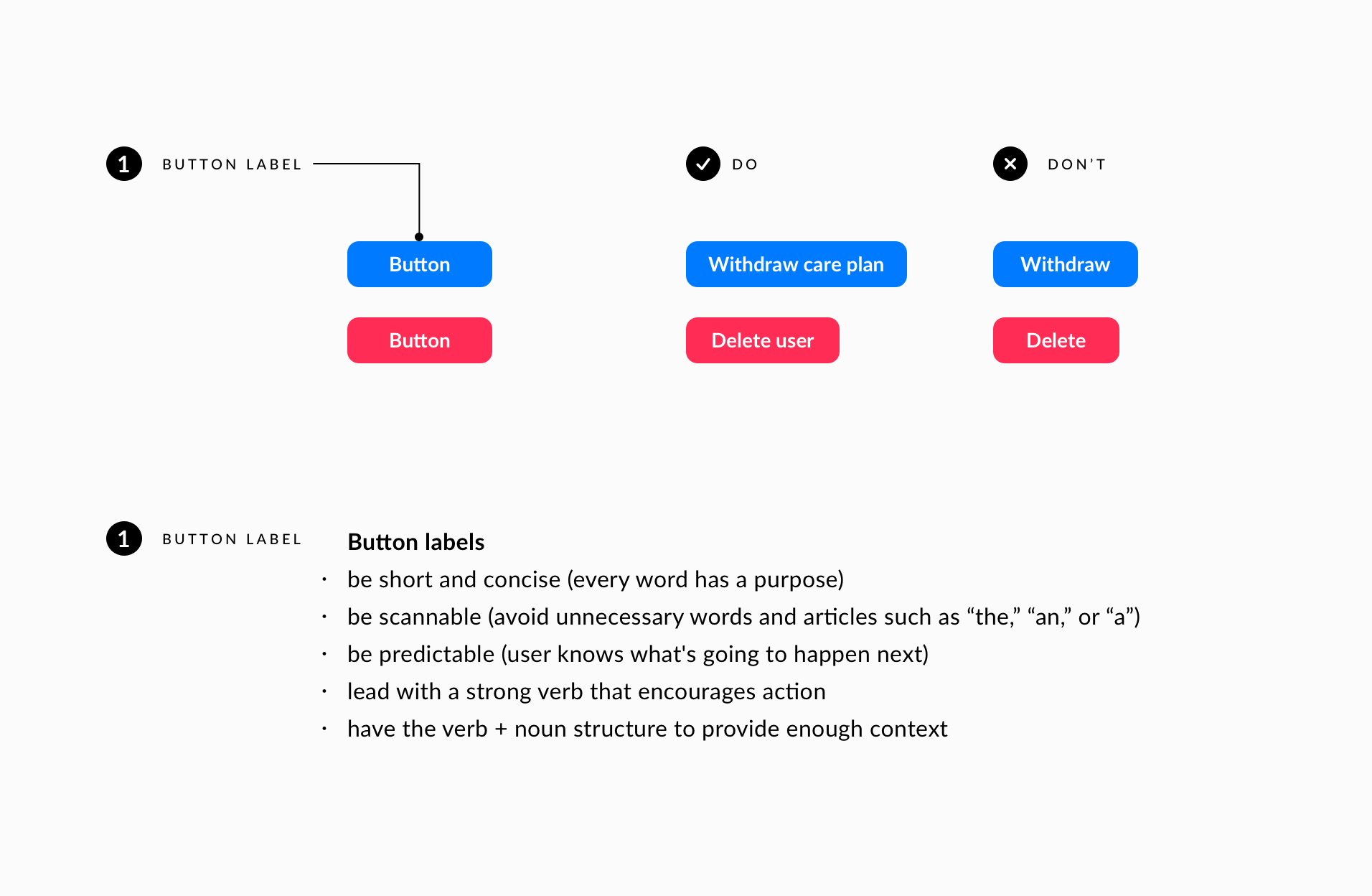 Instructions for writing clear button labels that reassure the user about the action he is taking.
Next to the rules we will include lots of examples of dos and don'ts, which are a great learning tool.
The editorial part will be defined in the future together with the marketing team.
Complex vs simple
We develop complex products, so we don’t need to be cute or engaging in our notifications. However, even though or precisely because of the complexity, we do want to be useful, precise, simple, and human in our communication, not dry and full of technical jargon that complicates things even more.
-1.png?width=1912&name=MicrosoftTeams-image%20(64)-1.png)
The difference in language when communicating with users. Clear instructions, structure with paragraphs, and a friendly tone provide a better experience for the user.
What guides us in writing the so-called microcopy is knowing that our messages need to be practical, short, direct, understandable at a glance, and enable our users to perform tasks smoothly.
As we now explained why we need the content guide, read our next blog where we will explain why we decided to first create writing guidelines for notifications, what are the components of our content style guide, and how it makes the lives of our users a bit less stressful.
Related posts
This article is part of a series on our design system. Join us on the journey of creating Better design system — with significant improvements we achieved and some wrong turns we had to take to get there.
Read the first blog in the series: Building a design system for digital solutions in healthcare
Read the second blog: How we used our design system and low code building tool for long term clinical data collection and visualisation