Design
Building a design system for digital solutions in healthcare
Having a design system allows us to be more efficient, consistent, and ready to scale, while enabling designers and developers to collaborate and communicate better.
No more inconsistencies
Better exists to simplify the work of healthcare teams, so it would seem only logical that we would also strive to simplify the work of our design and development teams. But we weren’t.
Every time we wanted to design a new screen, we started from scratch. This was not only time-consuming but it also left us with inconsistency in the design. There was no library of components to choose from and no proper documentation on how these components behave. Not only were designers frustrated because of this, but developers also had extra work. Therefore, we decided to create a design system.
So what is a design system?
“A design system is a collection of reusable components, guided by clear standards, that can be assembled together to build any number of applications.” Invision
.png?width=1912&name=MicrosoftTeams-image%20(31).png) One of the most famous systems we all know, Legos. Photo: Unsplash
One of the most famous systems we all know, Legos. Photo: Unsplash
The simplest way to explain a design system is actually with everyone’s favorite toy, LEGOS. Every LEGO piece is compatible with another by following a universal system of design. Thus, pieces can be assembled into nearly any imaginable structure, just ask your kids.
A design system for interfaces is also made up of basic elements or blocks, such as icons, buttons, form fields, and many others that can be combined differently depending on what we want to build. Each of these blocks is not only designed but also written in code. It means that when you’re designing a screen or updating an old one, all the pieces you need are already there.
Benefits of having a design system
In a fast-growing company design too needs to be fast and easy to scale. To achieve this, implementing a design system helps with:
- Greater efficiency: Because designers and developers are not wasting time building components from scratch, but rather reusing components, the design system increases its efficiency.
- Familiar user experience: Principles and rules on how to build complex components, help create a unified look and consistent user experiences across products, making users “feel at home” when interacting with them.
- Building at scale: Greater efficiency and consistency of design allows us to build products at scale.
- Better communication: The design system is like a language, shared by designers and developers, so there is less chance of miscommunication.
- Focus on the user: Once design and development is streamlined, designers can shift their focus from building an interface to where it really matters – improving user experience.
A modular design system for healthcare
All the big names like Google, IBM, and Spotify developed their own design systems that are publicly available, so we could opt for any of them. However, those design systems, although an invaluable asset, tend to be more generic and offer basic solutions rather than specific — and the demands of developing digital products for healthcare are very specific.
We saw an opportunity to start building a design system created especially for healthcare. This means that every decision is made with the awareness of the environment our applications are used in. We also follow and adapt useful guidelines from healthcare organisations that already have their own design system, such as the NHS.
The four parts of our design system
Better design system consists of four parts, each designed and tailored to provide a consistent experience in using our clinical products.
Application building components
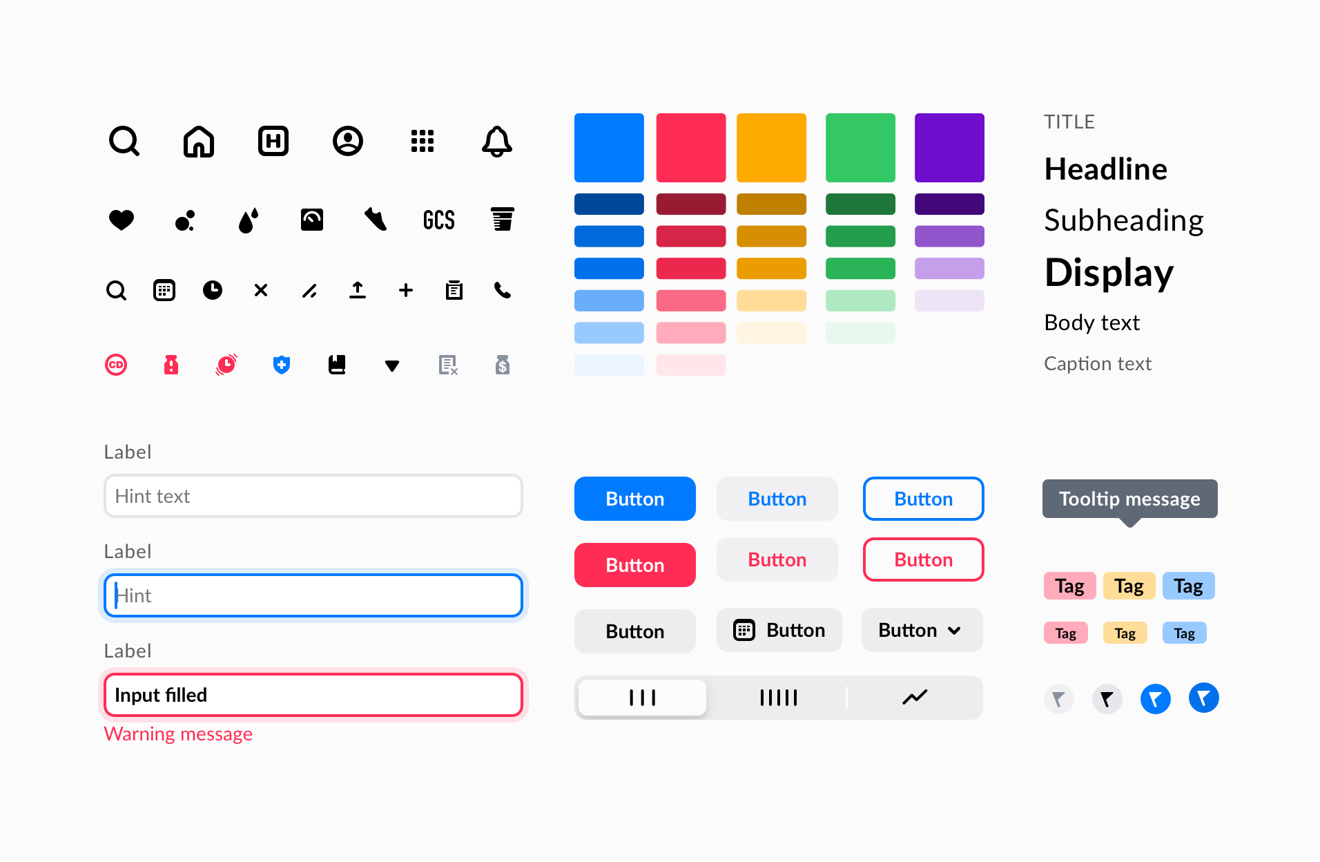
 A look into our basic application building components - our building blocks that help us build complex patterns faster.
This part covers components and patterns we need to swiftly build new applications. We take special care of these building blocks, not only in how they look, but even more in how they behave and interact. Equally important is the so-called microcopy, like rules on naming actions and labels or how to write helpful tooltips.
Clinical data visualization system
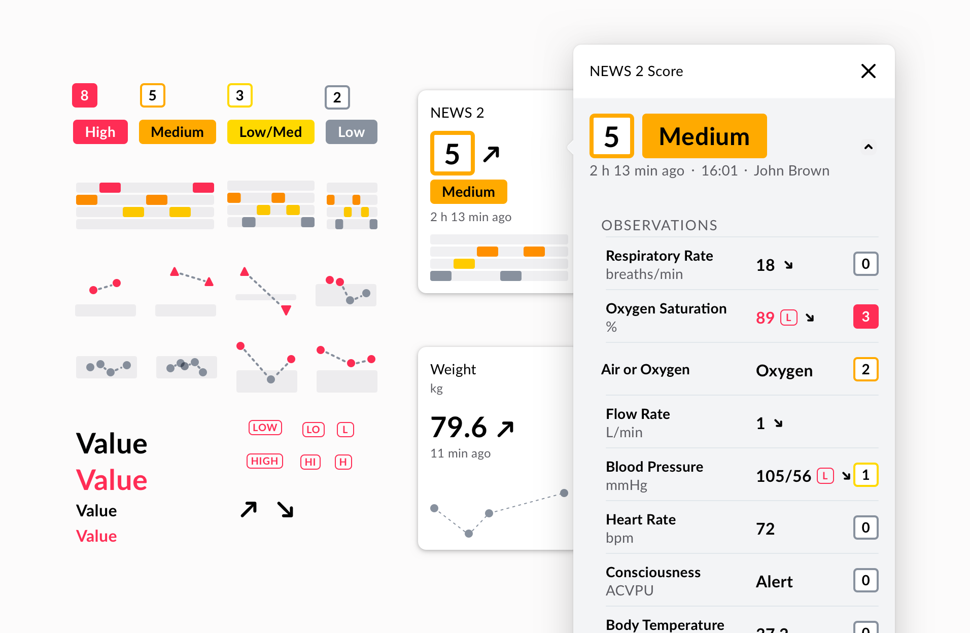
 Snippet of our clinical data visualisation components and their use in clinical concepts.
What really sets Better design system apart is its clinical data visualization system. Clinical data visualization is the graphical, user-friendly representation of patient information and data. With such visual elements as charts and graphs, data visualization helps clinicians to grasp and understand trends and patterns - and, ultimately, deliver better patient care.
Following our design system principles, we designed a set of flexible and generic components, able to show a massive variety of clinical data. These easy to reuse building blocks can display vital signs, lab analyses, scores, prescribed medications, orders, documents, and more.
Clinical data visualisation system will be later executed in code and used in our clinical applications. We are exploring the possibility of offering the building blocks in an online marketplace, together with our low code view building tool, that will allow clinical content to be published and shared among the community.
Clinical forms
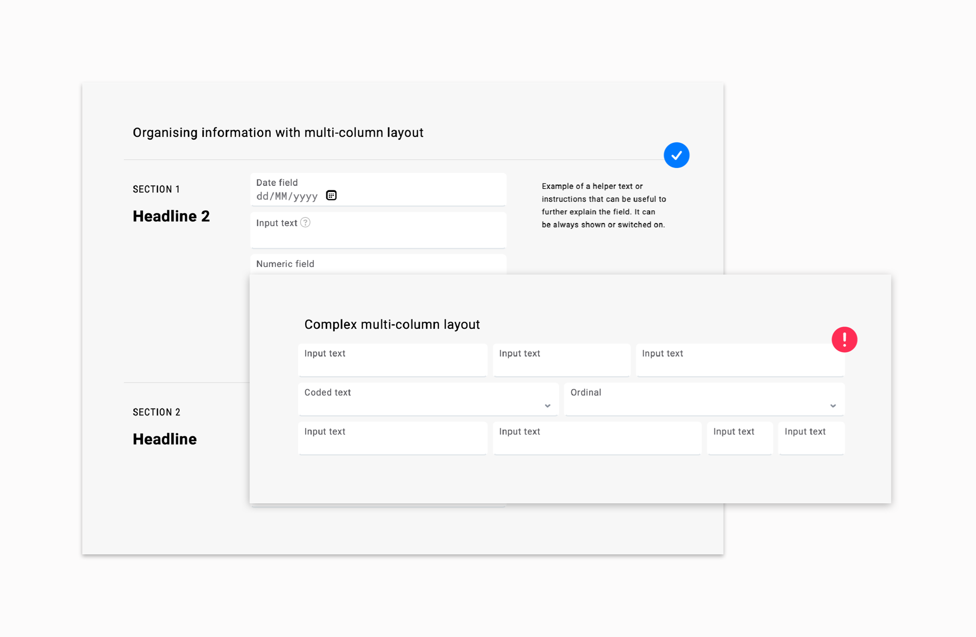
 Our form building tool in Studio is equipped with tips and guidelines for building better forms.
A special place in the Better design system is dedicated to clinical forms, designed for clinical content, and for use in clinical settings. This is not a common practice in other design systems, however, forms are an essential tool for collecting data in healthcare, so we dedicate a lot of our time perfecting them to be simpler to build and safer to fill for end-users.
We also prepared a “how-to” guide for creating user-friendly forms in the Form Builder, a powerful tool for designing forms in our low-code development environment Better Studio.
Content style guide
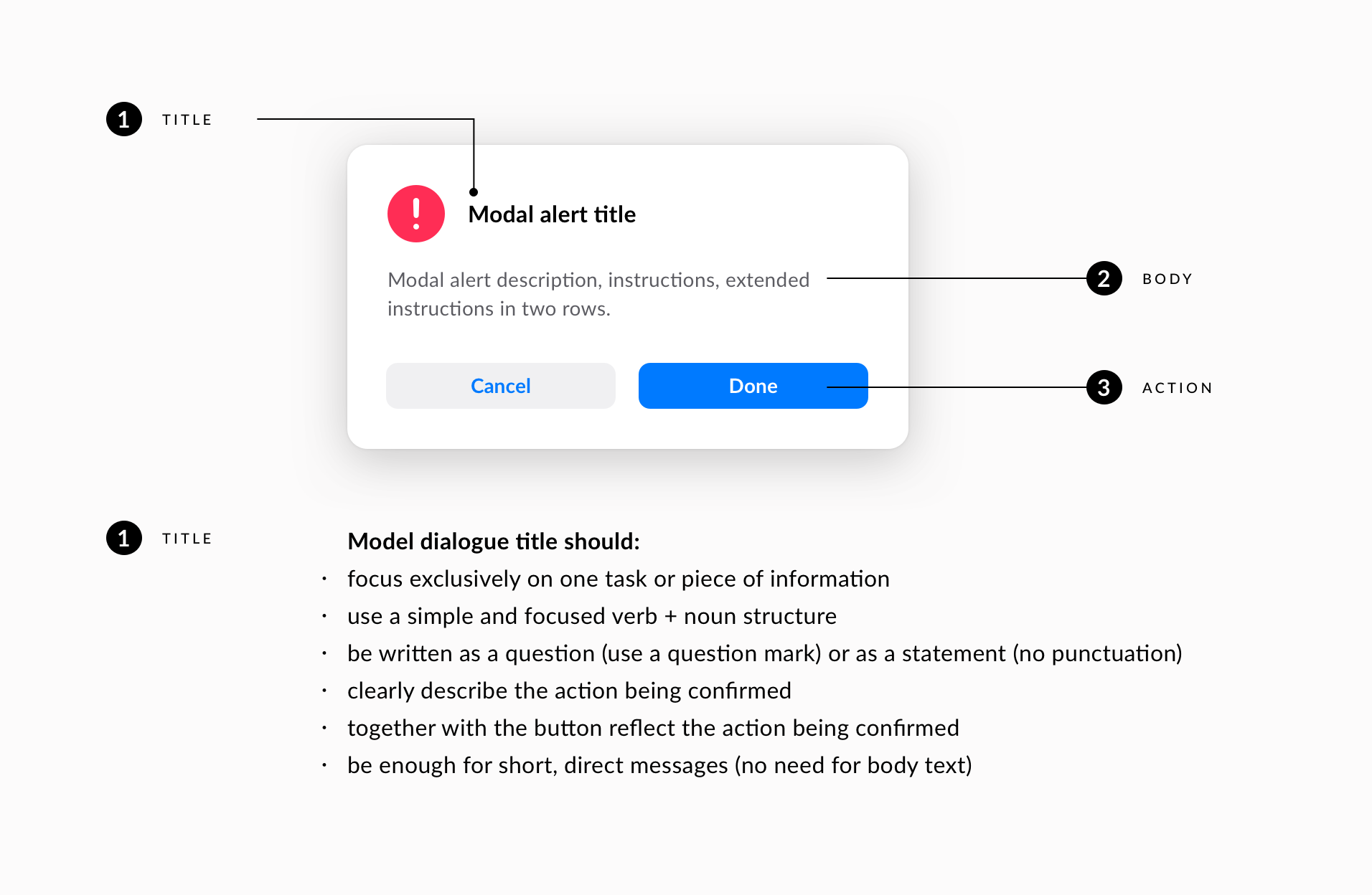
 Content style guide for notifications and alerts has a precise rule to ensure that the user is comfortable when resolving a modal dialogue.
We are also in the process of establishing rules for non-visual elements, like the tone of voice and writing rules. A content style guide will help us write in a clear and consistent way across products. It will bring content consistency, and brand consistency and save everyone's time.
To start with, we tackled notifications and alerts, as these were really messy and didn’t contribute to a good user experience. Rules were written for each notification type, followed by the good-old “Do” and “Don’t” examples.
Our content style guide will evolve significantly throughout the year.
Created by a diverse team
Our design system team is small, but each member has a unique set of skills: from UI and UX designers and developers to UX researchers and UX writers. It is a place where all these profiles meet and do their magic.
While designers are constructing new components and patterns or improving old ones, developers are transforming them into code, writers are giving us rules for how we sound like, from how a button should be named to bigger concepts.
The work is never over
The design system is never complete and our work is never over. It is a living and breathing entity, meaning it will require ongoing maintenance and improvements. And we are looking forward to that.
Component-based design can support faster, affordable, and scalable development of digital products for healthcare professionals. So we invite you to read the upcoming blogs on design system and join us on the journey of creating Better design system — with significant improvements we achieved and some wrong turns we had to take to get there.
Further readings:
- https://www.invisionapp.com/inside-design/guide-to-design-systems/
- https://www.nngroup.com/articles/design-systems-101/
- https://carbondesignsystem.com
- https://principles.design/examples/nhs-design-principles
- https://material.io/design
Related posts
This article is part of a series on our design system. Join us on the journey of creating Better design system — with significant improvements we achieved and some wrong turns we had to take to get there.
- Read the second blog in the series: How we used our design system and low code building tool for long term clinical data collection and visualisation
