Better Platform
The two parts of our design system — forms and clinical data visualisation — that work together to give clinicians a better overview of long-term health conditions. Plus, the low-code tool that builds it all.
About patient registries
Patient registries collect data periodically over a longer period of time (sometimes a lifetime) for a group of patients that share the same diagnosis or other specific long-term health conditions. The dataset (disease-specific clinical data, such as labs, medications, and clinical scorings) and the data collection patterns are predefined and often follow international guidelines.
There are many reasons for such systematic tracking of data through time, such as improvement of treatment, research, gathering data for AI learning, and clinical studies, just to mention a few.
We develop our design system gradually through different use cases. Today we will dive into the Cattedra patient registries case and how it helped us build the missing building blocks in our design system. Cattedra is a project where we developed forms and solutions for four registries, each of them dedicated to paediatric patients with different autoimmune diseases. We provided them our Care plans and registries module to serve their needs for tracking patients data.
Collecting data with user-friendly clinical forms
One of the main reasons why clinical forms are part of our design system is that they are an essential tool for collecting patient data. The second reason is that building user-friendly forms is quite a challenge. So we did the hard work of making that friendlier for everyone.
For Cattedra we built 33 forms in our form-building tool, where openEHR templates can be imported and forms built with a drag and drop, tweaking the design later. We could also build a form from scratch, using generic elements, and write EHR views later.
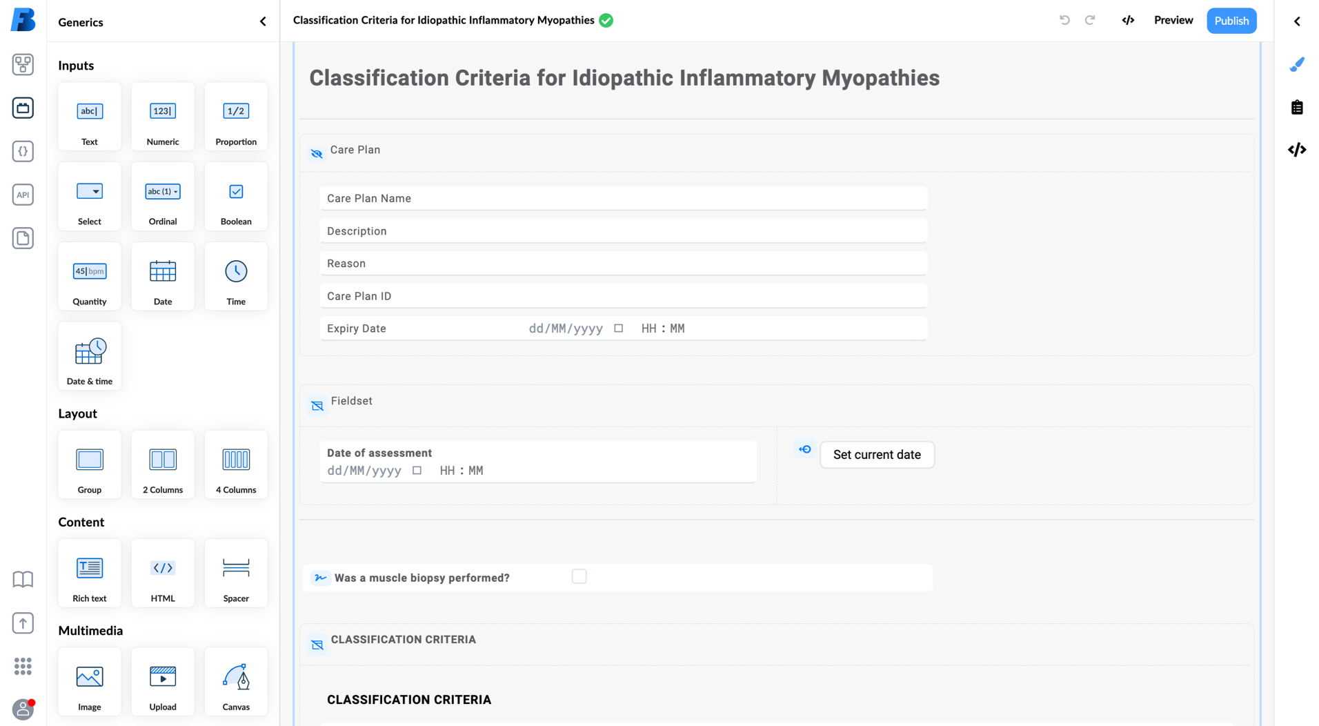 Building forms in our low code building tool.
Forms for Cattedra were one of the most complex forms ever created. And the fact that all the newly created pages were done in a low code way, makes it even more special.
Better clinical forms
While designing elements for clinical forms we had two different types of users in mind: the one that builds forms in our Form builder tool (a power user) and the clinical staff and patients, who will later fill in those forms.
How we improved the design of Better forms:
- We put labels inside the field. The layout of the form becomes more robust and straightforward.
- We grouped information next to the field or the value. It makes it easier to fill in the form.
- We introduced a light grey background to visually separate fields from other accompanying content.
- We added additional text styles for headlines to give structure and hierarchy to the form.
- We published a guide on how to design better forms to help users with designing more complex forms.
- We developed useful functionalities. A pre-fill option for data from different source, multiplicity containers that allow users to repeat content multiple times (useful for entering medications, symptoms, multiple addresses, and the likes), and an advance dependency logic, like hiding irrelevant fields.
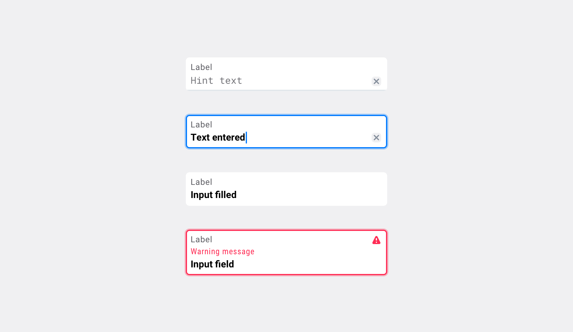 Our redesigned field anatomy and its states.
Better patient facing forms
PROMs (questionnaires for patients that help clinicians to assess the impact of the disease) are somewhat specific, as they are mostly used by patients not clinicians, so we have to adapt our design to make it even more accessible and user-friendly.
We already implemented some much-needed improvements:
- Language selection.
- Multi-page functionality that allows for a step-by-step filling in of the form.
- A slider, used as a VAS (Visual Analog Scale) or NRS (Numeric Rating Scale) commonly used in questionnaires.
- Dependencies to enable showing or hiding additional instructions that are there to guide the user.
- Responsive design to work on all devices.
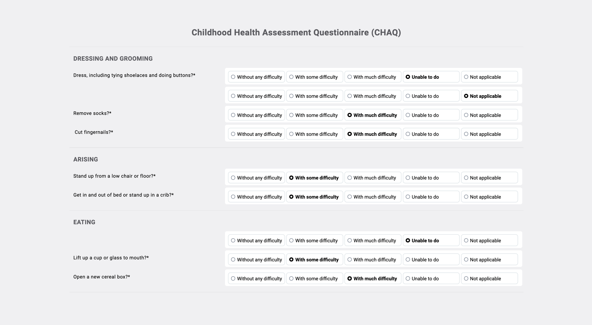 Example of “Patient reported outcomes” form.
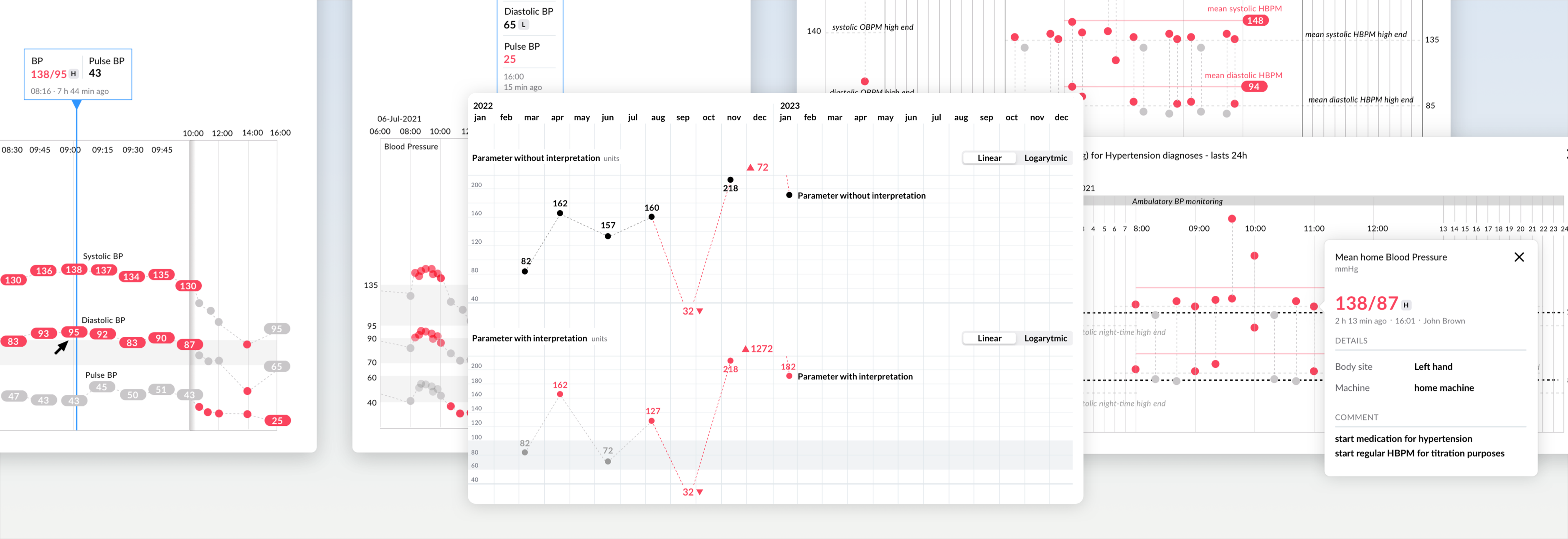
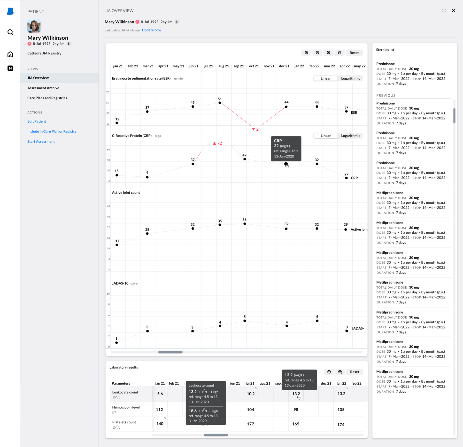
Visualisation of patient clinical data through time with a low code tool
Health records are often organised source-wise, meaning that patient’s data is scattered among myriad tabs, sites, and apps (which often require an additional sign-on). As clinicians try to understand a patient's clinical picture, they need to remember information from one source to another, which is hard and takes a lot of time.
We try to solve that problem with aggregated clinical data views, where all the relevant information is shown in one place. That makes trends reading and data comparison much easier and faster.
When reading data over a longer period of time everyone has their own preferences. Some users prefer seeing it in graphs, others in tables. That’s why we support both. Timeline graphs and tables allow users to follow the trend of one parameter over time and compare it with other parameters. This makes tracking the dynamics of the disease or response to treatment much easier.
 Example of disease-specific overview build with low code approach and Clinical data visualisation system.
Timeline graphs, tables, and lists were already part of our clinical data visualisation system for a long time. But while working on disease specific registries, we finally acquired the know-how to develop these elements in a far more efficient low-code approach.
Building such views in our low-code building tool is handy. Widgets can be configured in the tool itself. Data retrieved using EHR views or AQL queries is used as a data source for widgets.
Example of graphs settings:
- Switching on / off: toolbar for zooming in and out, use of reference range, values interpretation, logarithmic scale.
- Show / hide: horizontal lines, vertical scales, scale, value’s numbers, value’s details on hover
- Customization: units on Y axe, scales step, min, max value on graph, reference range for values interpretation.
What's also great about our modular design system and low-code view-building tool is that content and layouts can be created and adjusted much quicker compared to the classic “custom coded” approach. That’s also important for building versions for user testing that helps us to pick the most appropriate solution for each use case.
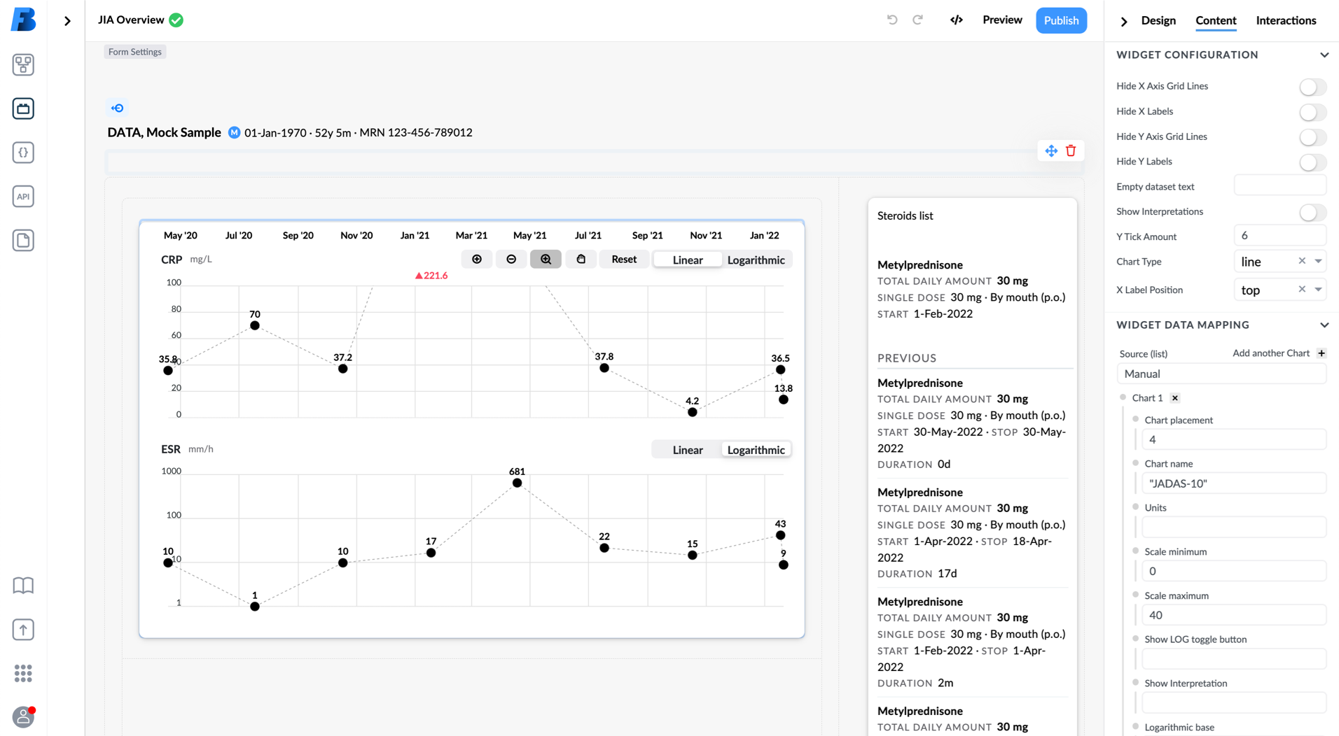 Building views in our low code building tool.
What’s next
We are always searching for use cases on the market where our openEHR platform with low-code building-tools and design system could bring a significant improvement in delivering better care.
If you are one of them, please let us know, so we can do what we do best: design some more building blocks and patterns for you and for our design system.
Related posts
This article is part of a series on our design system. Join us on the journey of creating Better design system — with significant improvements we achieved and some wrong turns we had to take to get there.
- Read the first blog in the series: Building a design system for digital solutions in healthcare