
Design
Moving away from a multi-tool framework is more than just a software change; it's something of an evolution. This transition not only boosts efficiency but also introduces real-time collaboration among designers and developers and brings much needed consistency to our designs.
Most design teams aim for “one source of truth”, but in reality, they are juggling many tools, platforms, and softwares. We were once using three different tools, which meant three times the accounts, subscriptions, and maintenance. It was tough to keep our designs consistent and updated. Plus, while updating our components to Angular Material and introducing design tokens (read our article about it here), creating a new library from scratch seemed easier.
Everyone agreed it was time to streamline and move our UI library to the new industry standard, Figma; however, there is, as you know, never the right time for a move.
Benefits of moving an UI library
So, we did what everyone else does, we kept our eyes on the many ways the move to Figma will make our work easier:
- Real-time collaboration
Using a cloud-based design tool would let our team work on the same project at the same time, making it easier for everyone to collaborate. - One software replacing all the rest
Imagine a true “one source of truth” for designers: a library which is constantly updated and kept to date. - Easier development handoff and inspect
Handoffs between designers and developers would be much simpler. Developers could inspect designs, access design specifications, and even grab code snippets directly from Figma, reducing miscommunication and streamlining the implementation. - Lower maintenance
We would maintain design systems so much more efficiently. Everyone would be using the correct and most updated versions of our design elements. - Quick prototyping
Designers could use robust prototyping features to create interactive models faster. This is essential for testing and confirming design ideas before the development begins.
How we did it
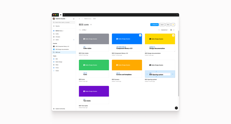
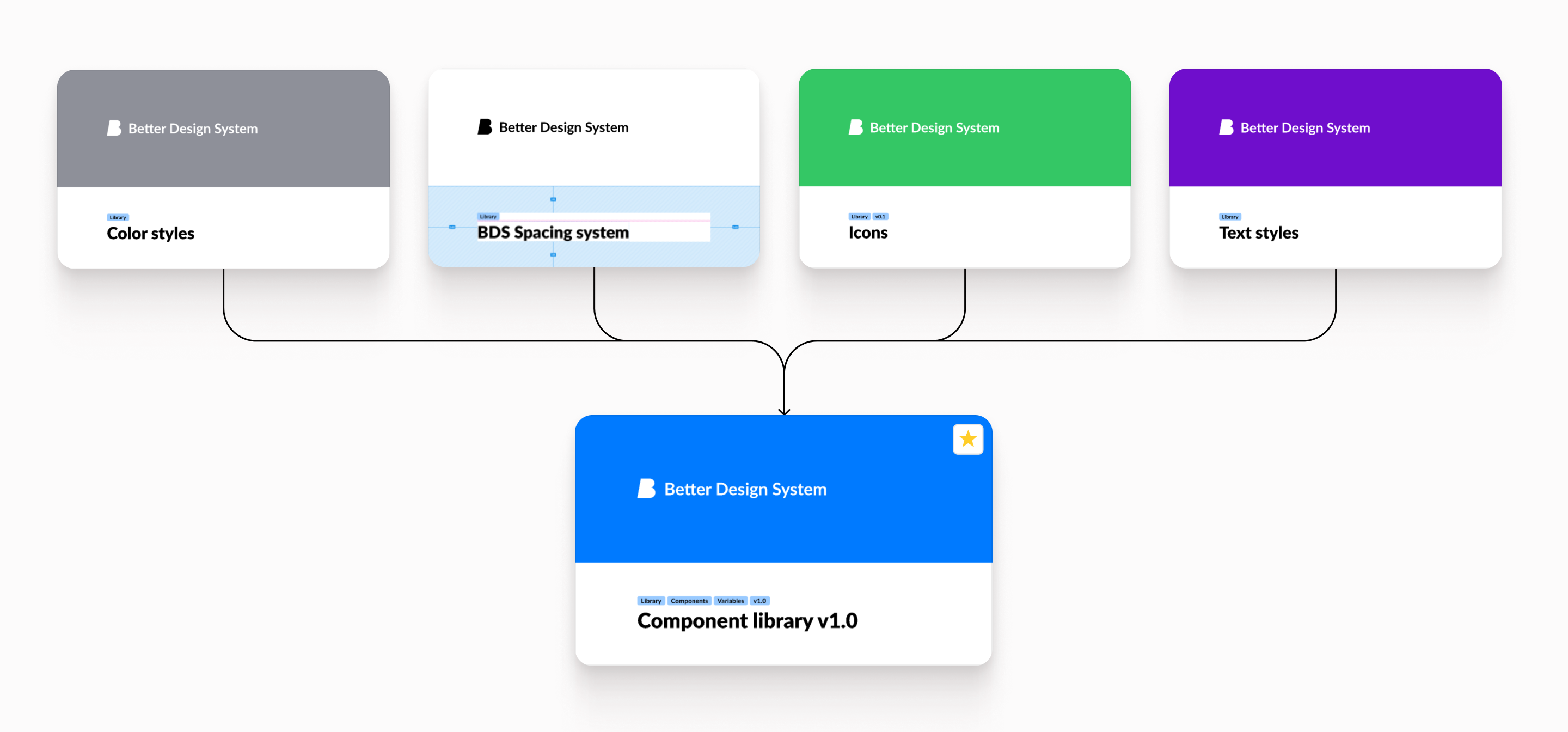
First, we made libraries for colour, typography and icons, called core libraries. These were directly linked to our design system’s core using design tokens and the Figma plugin “Tokens Studio". This now presents the foundation of our Better Design System UI library, making it easy to change multiple tokens and just push updates to the component library without hustle.
Then, we moved on to components. We made base components, connected them to core libraries for typography and colour, and tested them with developers to get them as close to code as possible.
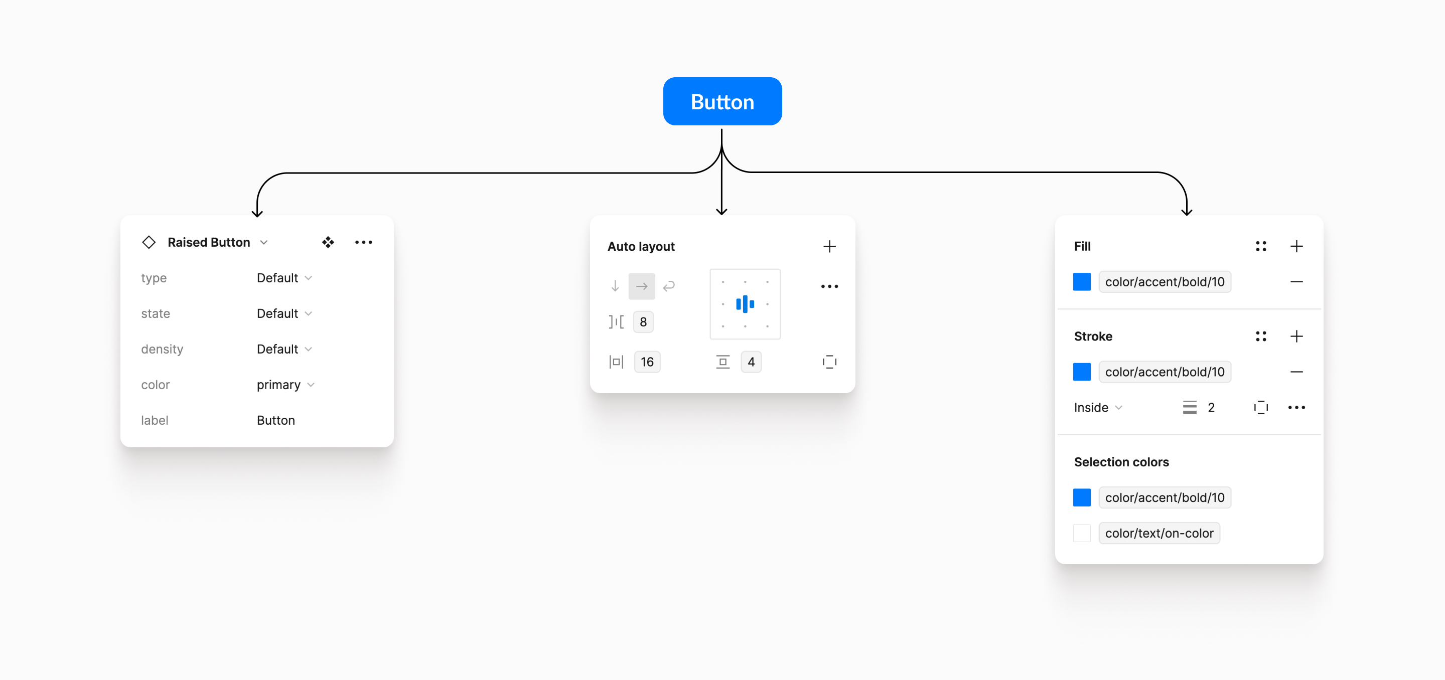
This means our UI component library is very close to the production code and our prototypes look similar to the developed applications, minimising discrepancies between the design and the actual implementation. Each component underwent rigorous testing and received approval from the Better design system team.
From multiple to single
Before the migration we often faced problems with duplicate files, not being sure which design version was the final one, and the biggest issue was not having a single source of truth. This made it hard to know which components were finished and which ones were still being worked on.
We used to design in Sketch and Zepplin for handoffs. After switching, we do everything from brainstorming to final prototypes and handoff designs in Figma and its sibling FigJam. Now, components are constantly updated and pushed to all designers. With straightforward updates and library upgrades, our design is always aligned with the implementation.