.png)
Design
What’s the role of subtle animation in healthcare applications, what are its benefits, and how it has become an integral part of our design system, ensuring consistency and coherence across our products?
About motion design
Animation brings still images to life, and while we may not desire interfaces that literally spring to life, the inclusion of motion has become a vital part of modern digital products. Mitigating how things move in real life makes interfaces more human, intuitive, responsive, and thus user friendlier.
Visual hints can be helpful and communicative – when used in moderation. Too many of them in, for example, healthcare applications can not only be fussy and annoying but can also jeopardise patient safety. In short: we strive for less delight, but more usability.
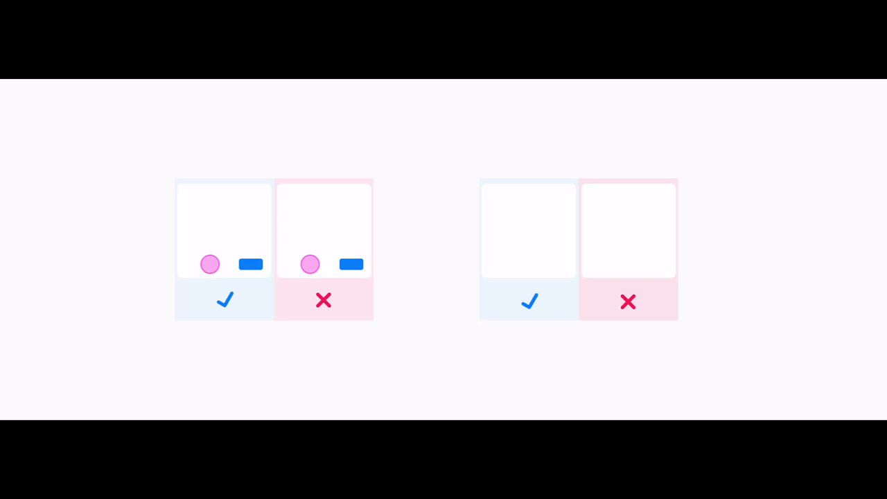
 Allergies module is expected to communicate several statuses. Using multiple color icons can get confusing, so to effectively convey the validation status we decided to use animation. This pulsing animation not only shows whether validation is needed but also serves as a subtle prompt for the users to take necessary actions.
The benefits of motion in complex products
Working in healthcare means we have to keep animation light, subtle and unobtrusive, yet clear and with a logical purpose. Every movement has to serve a purpose and, in some way, enhance the user experience.
We use functional motion to reduce cognitive load, prevent users from missing important information, feedback or updates, and help them understand how things are arranged and relate to each other.
Animation in our products has three main purposes:
• Improve usability: provide visual hints and feedback to the user. It helps indicate progress, or provide confirmation, making interactions more intuitive and understandable.
• Direct focus: steer the user's attention towards valuable information or important features.
• Facilitate orientation: serve as a visual explanation, assisting users in navigating the product with ease and confidence
How animation became part of our design system
It all began with a humble snack bar (the bar that reassures the user that their email was sent or in our case a form was submitted). We were asking ourselves, should it just appear, or should it slide in? From the left or would it be better from the right? Bottom-up? Since we didn't have an animation expert on the team, we extensively researched how other design systems implemented animation and learned from their documentation. The book Designing interface animation by Val Head was a huge help.
Testing and exploring snack bars. We constantly ask ourselves whether animation enhances or distracts user focus, whether it is subtle enough or potentially too heavy or disruptive.
This is how we did it:
• Analysed the components to identify suitable areas for animation.
• Created a list of components for animation.
• Engaged in a trial-and-error, testing various animation approaches.
• Started writing documentation of animation guidelines for designers and developers.
Skeleton animation creates the appearance of something (in this case data retrieving) happening in the background by showing shimmering gray shapes or outlines during the data loading process.
Waiting for data as a good moment for animation
In healthcare, a common scenario involves waiting for patient data to load and this is a great opportunity to use visual cues effectively.
A blank screen on its own doesn’t convey any message, we may feel unsure if anything is happening or if there is an error. To improve this, skeleton loaders are used.
However, implementing skeleton loaders presented a challenge. Data loading does not happen asynchronously; if one element fails to load, the entire process fails. So, we couldn’t use a skeleton loader for each element.
What we could do was make a typical skeleton page example based on data (not exact data but more abstract representation of data). This example is displayed if the data retrieval takes longer than two seconds, providing users with visual feedback and a reassuring indication that the content is being loaded.
Follow the guidelines
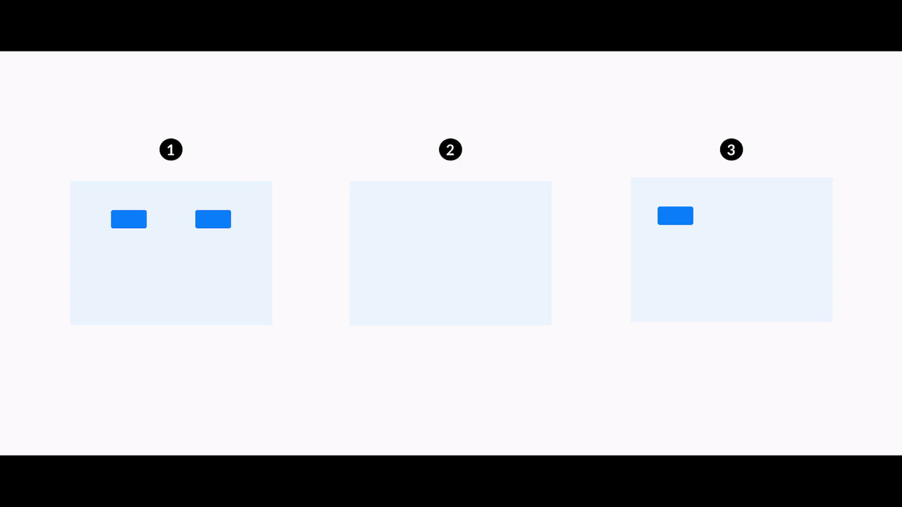
In the design documentation, we outline three principles that guide our approach to achieving a calm yet responsive feel: responsiveness, orientation, and contextual awareness.
Additionally, we place great emphasis on defining the duration of motion. For instance, smaller elements typically have shorter durations, while larger elements require longer durations. Furthermore, we include guides for easing to ensure a more natural movement (easing determines the smoothness and timing of the animation transition).

Here you can see a combination of different animated elements working together in an interface.
An implementation guide also helps developers choose the right type of motion, based on whether the movement is triggered by a user or initiated and controlled by the system itself. Also, a quick checklist is very handy for developers to refer to and ensure they have covered all the important aspects.
What's next
Our documentation and animations guidelines are growing and being updated, thanks to feedback from designers and developers. Front-end developers are actively integrating animation features into their coding components, known as "tokens." More about tokens in an upcoming article, but in short, an animation token can define the duration, easing, or other properties of a specific animation, making future updates and changes much more streamlined and efficient.
Animation principles as displayed in our documentation.
1. Responsive motion
2. Oriented motion
3. Contextual motion
We also include some helpful guidelines with do’s and don'ts.
This collaborative effort will ensure that our animations remain cohesive, consistent, and easily implementable across our products.
Checklist for when designing motion• Is your motion purposeful? |