Design
Between data dispersion and cluttered clinical views, clinical staff are missing relevant patient information that’s aggregated and available at a glance, like it used to be on the good old paper chart. Our design team set out to recreate those benefits. Here is where this led us and what it meant for our design system.
Bringing back the paper charts experience
»Having the paper chart at the end of the bed was such a powerful tool, because you pick it up, look at it and give it to someone else within, you know, two seconds, and get a really good grip of how that person has been for 24 hours.«
Surgical Consultant, NHS
When patient clinical charts were kept on paper by the bedside, clinicians could scan the latest vital signs, lab results, and clinical notes (and other relevant information) in a matter of seconds — just like they would scan the cover of the newspaper at breakfast. Electronic health record took this experience away by closing groups of data into separate places, tabs, links, even apps that require a separate login, while some data remains on paper. This causes data dispersion, one of the biggest reasons for the clinical staff’s frustrations, timewasting, and a root cause for burn out*. We asked ourselves - how could we as a company that is digitalising healthcare bring back the core of the paper experience – an aggregated view of clinical data? We came up with Patient Snapshot.
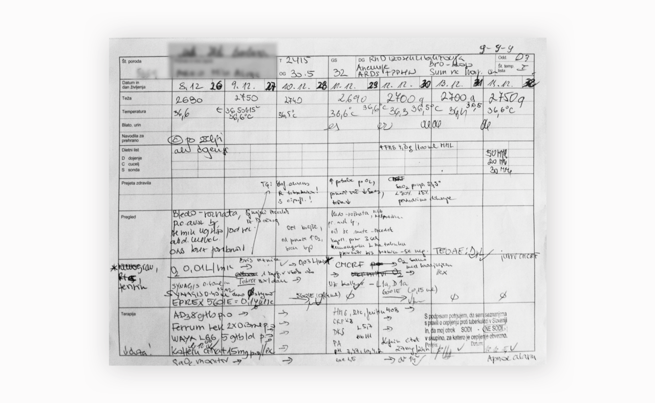
 Paper charts can hold vital patient information one sheet of paper – electronic health records took this experience away by dispersing data across the record.
What is Patient Snapshot
Patient Snapshot is an aggregated view of an individual patient's clinical data, available at a glance. The clinical data that the Snapshot contains is curated and interpreted in a way that makes it easier and faster to read and compare data, while also giving an overview of patient’s clinical picture. Patient Snapshot helps doctors, nurses, and other care teams make better informed decisions about treatment and care and it also assists them in tracking the progress of patient’s condition.
One universal Patient Snapshot, or hundreds of them?
When we started designing Patient Snapshot back in 2018, we couldn’t imagine how challenging it is to replicate the rapid overview that the paper charts enable. As we talked with more clinicians and nurses, we discovered that different users need different patient information at various times. They all needed similar content, such as clinical assessments, medical problems and diagnoses, medications, observations, examination results, notes etc., but which content was relevant depended on many factors.
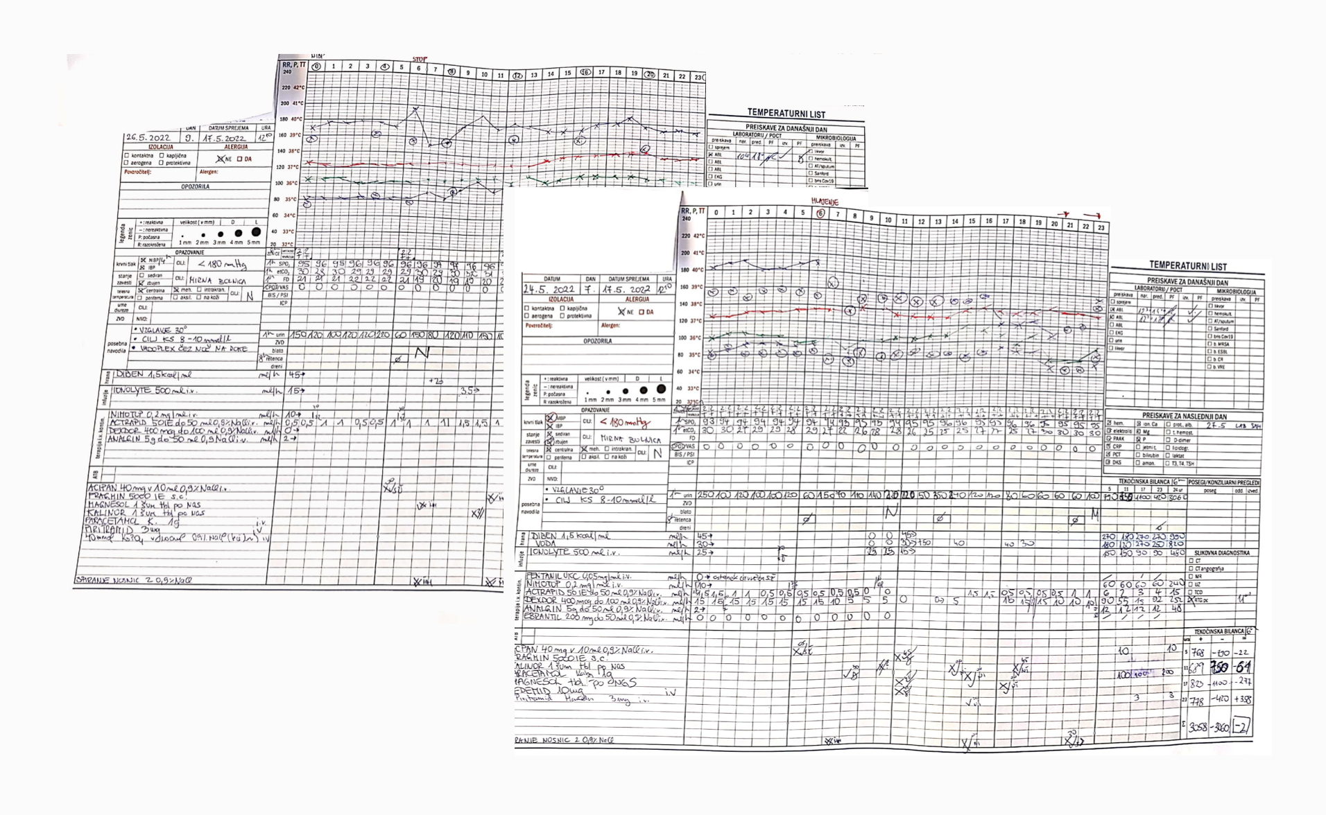
 Our very first mockups, based on a neonatal paper chart. Quite a challenge to translate the scribblings from paper charts and recreate real patient’s clinical picture.
Which patient information is relevant depends on:
- The ward, clinic, or institution where the patient is treated or cared for (for example a surgery or a neurology ward, speciality clinics, community, …)
- The role or subspeciality (GP, anaesthesiologists, cardiologist, haematologist, surgeon, …)
- Patient’s condition or diagnoses (are they acutely ill, deteriorating, medically fit, approaching end of life, …)
- Where on the clinical pathway the patient currently is (emergency admission, procedure or operation, rehabilitation, follow up visit, …)
- Tasks or jobs that need to be done during various occasions (at ward rounds, talking to patient’s family, handovers, transfers, discharges, reviews, emergency events, …)
We realised that what the clinicians needed is not one universal patient chart but hundreds of them. This meant we had two options. We could scope down and provide solution for one particular use case, or we could make a smart robust system that would enable rapid production of numerous different and flexible Snapshots.
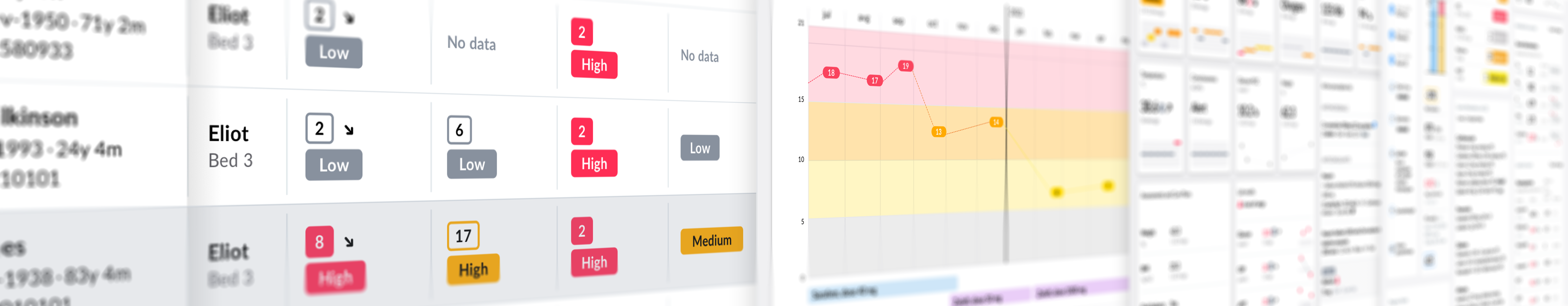
 Snapshots designed at different times during the year 2020. We needed them to test if our components for visualization are generic enough for all those myriad use cases. We tried to use relevant dataset for each use case.
We decided to do both. First, we created an Acute care Patient Snapshot and at the same time also started working on a Clinical data visualisation system as part of our design system that would in the future enable us to build numerous clinical views.
The problem with data dispersion
In the following years, we conducted user research in Slovenia and the UK. In both countries most users spend too much time logging into different apps, searching for patient information and organising it themselves by copying the information into tables and documents or writing it down on paper. Clinicians pointed out how they need to remember pieces of information if they want to compare them or create a coherent picture of the patient’s condition.
Dispersed data not only causes a cognitive overload but also creates a situation that is prone to errors, as so much crucial clinical information needs to be kept in one’s head*.
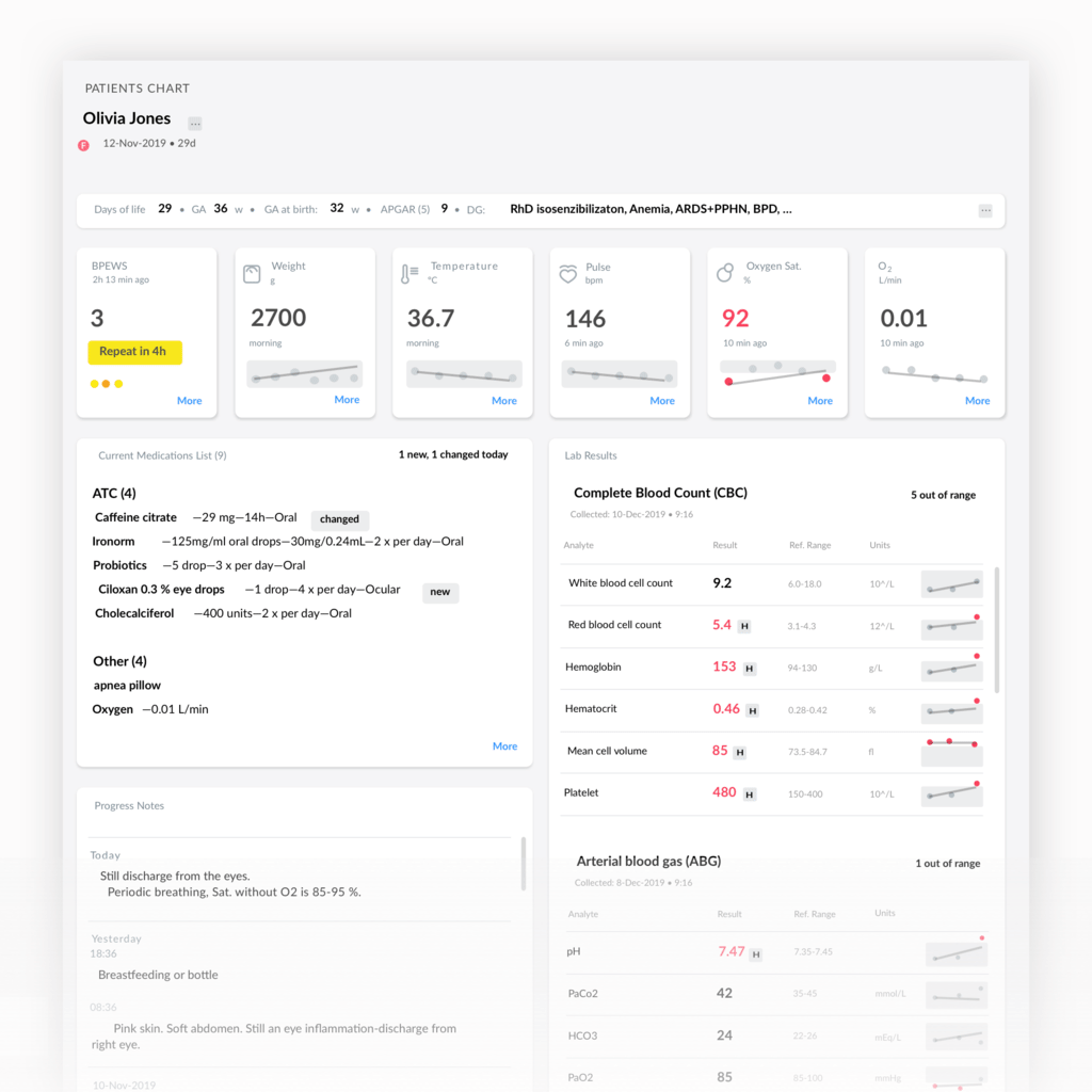
Patient Snapshot for acute care
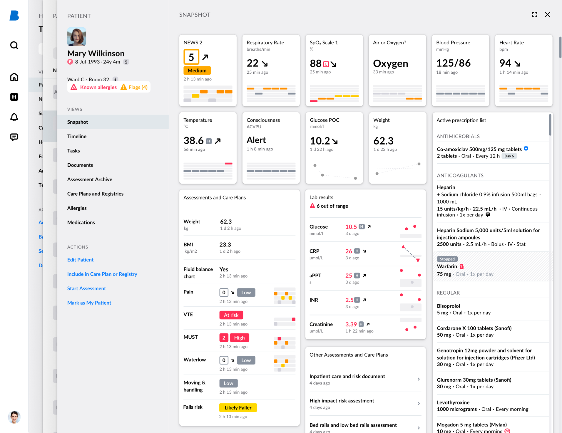
- Aggregated view of the most relevant clinical data used in acute sector (active medications list, NEWS 2 score with its parameters, selected lab results, nursing assessments results, and other)
- Built with generic building blocks (widgets) and patterns that can be reused for different parameters and are part of our Design system.
- Unified colour system for interpretation of various clinical scorings and scales results to ease the interpretation of its stratification stages.
- Selection and curation of clinical content, based on user research for a specific group of users and a specific client, but designed in the way that could be modified in the future.
The hard work of making simple generic building blocks
Our building blocks were tested on numerous use cases to see if they are generic enough. We played around with different content from different specialities and the blocks turned out to be sustainable and flexible enough for a large scale of clinical views, from summaries and dashboards to snapshots and documents.
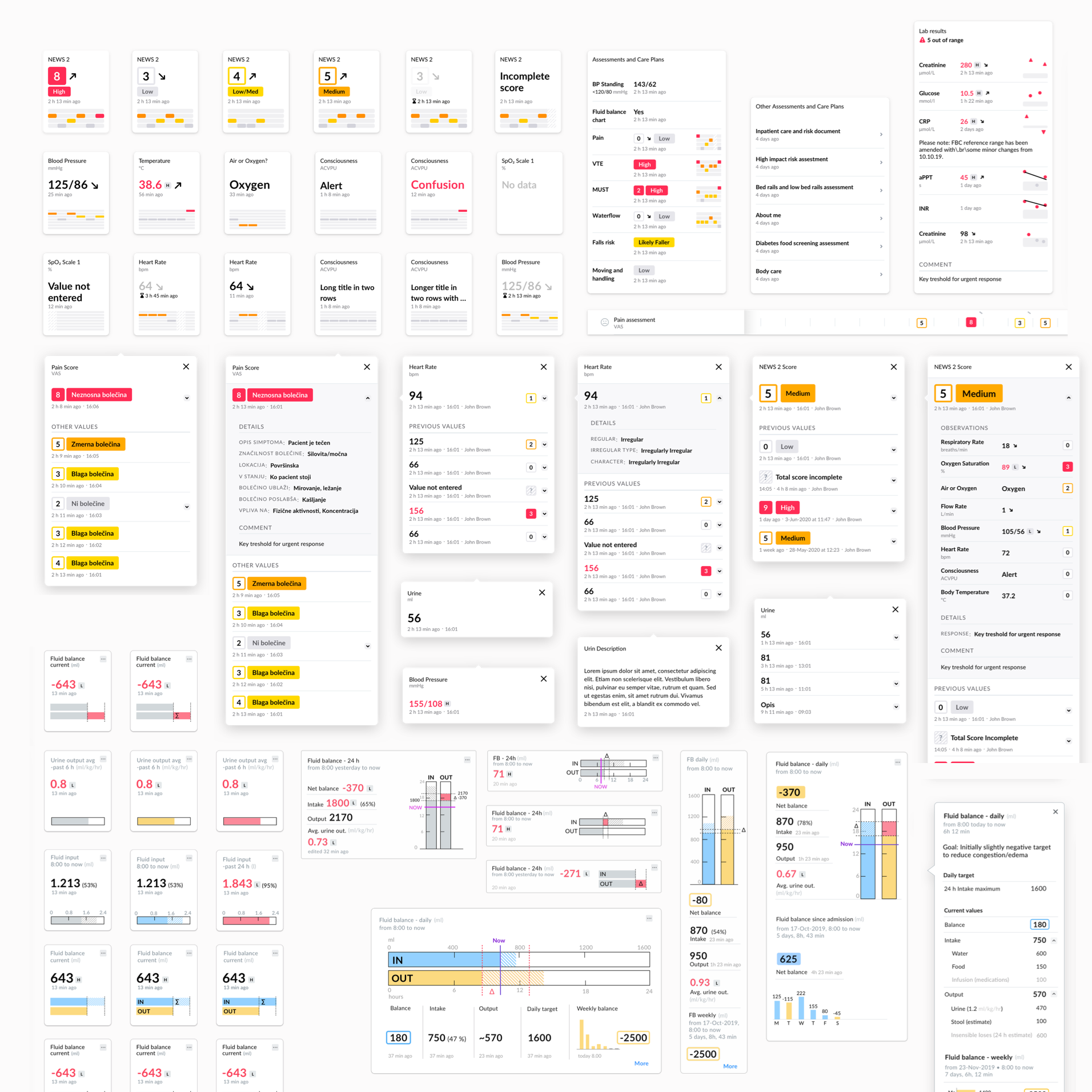 System of generic building blocks for clinical data visualisation
Based on user feedback and new use cases, we will design the missing blocks and improve the one we already have. We also need to provide a responsive design of clinical views to accommodate tablet and mobile devices.
While the first Snapshot was custom built, we are now slowly adding generic building blocks or widgets to our library with pre-sets that can be configured. Data binding will also be possible as a part of widgets settings. In the near future, the first series of widgets will be available in our low code view building tool. These widgets could be used to build clinical views such as summaries, snapshots, dashboards, and others, where patients' observations and assessment results are needed.
What we learned
- Cluttering is not helpful. You can't write a novel on a "cheat sheet". When aggregating dispersed clinical data in one clinical view, we need to be picky. Clear purpose of the clinical view will help to define criteria for deciding what to include and what can be shown on user's demand. Showing only the most important information first is crucial.
- Efficient data visualisation needs proper content curation and content design. It's not only what to show but also where (in which order) and how. Our clinical data visualisation system is all about how. This is where sparklines, score charts, and unified colour interpretation come into the picture. We did the hard work to make them simple to read.
- Visualisation of clinical data is specific and much more complex than data used in statistics or analytic tools. Each value or result has many »negative scenarios«. Information such as »Data not entered«, »Incomplete score«, »Old data«, »Deleted data«, »Recorded in error« are just some of them. The logic behind them (when to show which) could also be challenging. But they're all clinically important and all need to be shown in a meaningful way to ensure clinical safety.
- Defining a problem that we are solving with each clinical view is a milestone that shouldn’t be dismissed. That is why we are advocates of discoveries, iterative design, and users feedback testing. Even when citizen developers will be able to build clinical views themselves with our low-code tools and prebuild elements, we shouldn’t forget that building is only the last step in the process. Every house needs an architect, to research its purpose, think it through, design and make sure that form follows function.
What’s next
What started out as a product (patient chart) then became a project (snapshot view) and is now a playground for testing our building blocks for visualization of structured clinical data. But we are always searching for use cases on the market where our openEHR platform with low-code building tools and design system could bring a significant improvement in delivering better care.
If you are one of them, please let us know, so we can do what we do best: design some more building blocks and patterns for you and for our design system. Contact: maja.dragovic@better.care.
For our Clinical Data Visualisation System we are also nominated for this year's UX Design Award – Spring 2023. You can read more about the award HERE.
***
This article is part of a series on our design system. Join us on the journey of creating Better design system — with significant improvements we achieved and some wrong turns we had to take to get there.