Design
Establishing design principles for a design system and what it taught us
Design principles can sound like something only designers and marketing teams need. Indeed, most of them are quite catchy and roll off your tongue. However, design principles can be useful and effective for the whole product team.
After years of building healthcare products, we haven’t had anything tangible that would support our design decisions (especially in debates with developers, project managers, and other stakeholders) and align everyone working on the product. We may have internalised the way we work at a company that simplifies the work of healthcare teams. We may know what is important for us (meaning our users) when building products, but nobody has written this down and spread the word around. So, we set out to develop design principles for our design system. How hard can it be?
What are design principles?
NN group defines design principles as value statements that frame design decisions and support consistency in decision making across teams working on the same product or service.
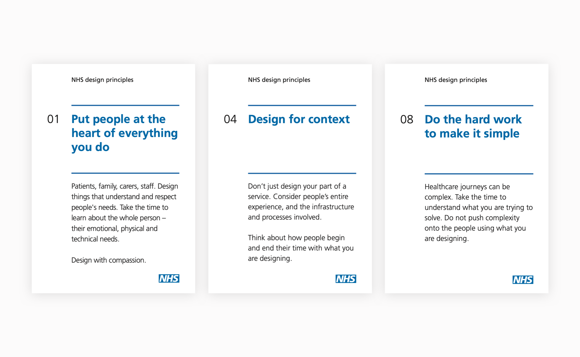
If you work in healthcare, you probably came across statements, such as ‘put people at the heart of everything you do’, ‘do the hard work to make it simple’, ‘make things open, it makes things better’. These are the NHS’ design principles headlines, which simultaneously give you goosebumps and empower you, which is what you aim to achieve. Design principles are not made up of thin air, the ones from NHS are based on their institution. We don’t have that, but what we do have are our company values, so we took those as our point of reference.

Example of three NHS’ design principles. You can find all nine of them here ( https://principles.design/examples/nhs-design-principles)
Design principles that work
Design principles express the shared vision of what makes a great product. But what makes a great design principle?
To avoid design principles being just pretty copy and do their job, Shopify says design principles should be:
- Actionable – design principles should guide you in solving problems or deciding on priorities. And really great design principles help you say no.
- Genuine – be inspired by others, but make sure your design principles are aligned with your company and product values.
- Memorable and concise – design principles should be like tag lines that everyone can say off the top of their head.
- Small in number – 3 to 5 principles are enough.
- More than a cliché – design principles shouldn’t be too obvious and general, such as ‘Keep it simple’ or ‘Easy to use’.
How we did it
Reading all the how-tos and talking with people who have already gone through the process of establishing design principles, we decided on a workshop, based on the template found on Miroverse
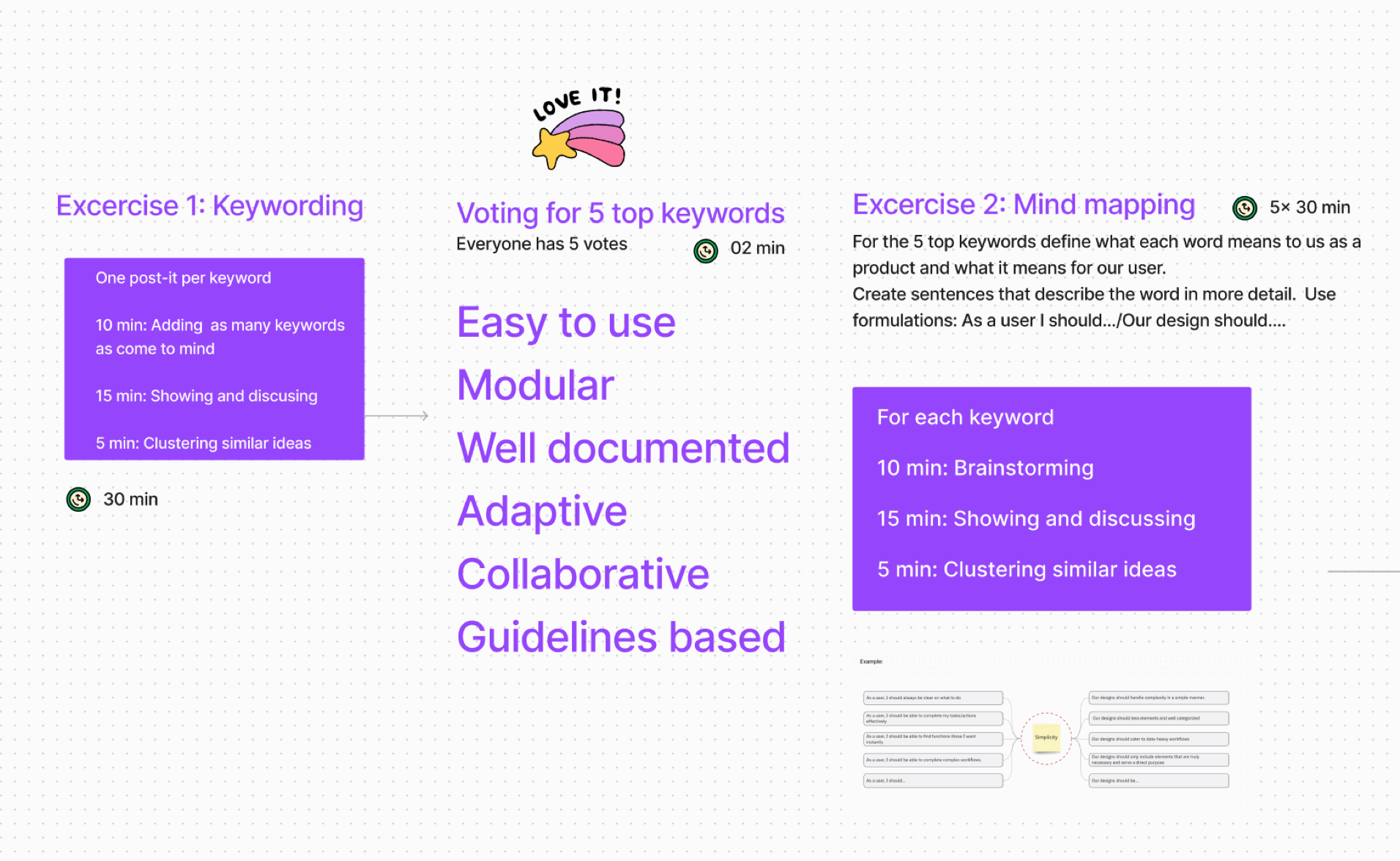
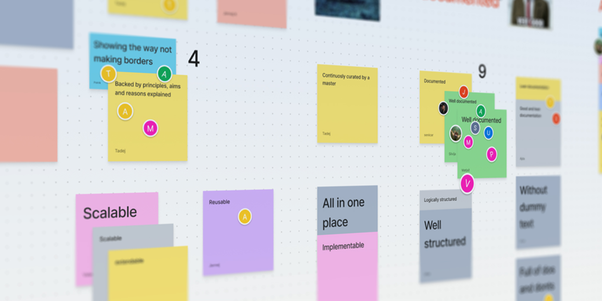
The workshop had us write down and vote for the most relevant keywords, then write 10 sentences for the five top keywords starting with ‘As a user, I should’ and ‘Our design should’. Half an hour in we had to pause and take a step back.

Example of exercises in Figjam.
What took us off course was, we didn’t establish what kind of design principles we are actually looking for: the kind that regard the end user, in our case care teams, or do we want to create design principles for how we build the Better design system. We decided on the later and continued more or less smoothly.
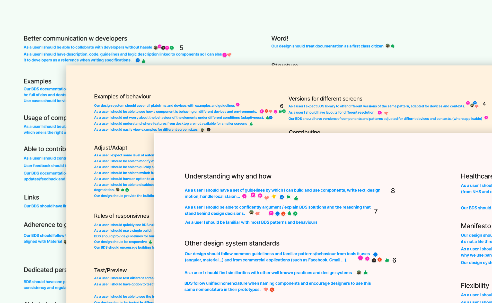
After a lot of time grouping similar sentences, we finally voted and selected the ones we found most relevant. Job done!

Voting for the most relevant sentences in each keyword group.
What if we try a different approach?
As designers, we can’t stop researching and improving processes. So, when we decided to try and establish design principles for one of our key products, Better Meds, we changed and optimised the workshop. For example, we found that writing ten sentences for each keyword is too much work and the enthusiasm just evaporated.
The day before the second workshop we stumbled upon an article by Matthew Ström on how he conducted a design principles workshop for the Wall Street Journal. It’s a great read and inspired us to try it. We loved that it should take you an hour (it didn’t but that’s okay, because it allowed us to take the time and really talk through each principle), and also it is a very useful tip on writing design principles: ‘even over’ statements (for example Accessibility even over aesthetics).
How to run a better workshop?
- Take more time – if you are not super skilled, the workshop will run longer than anyone says, so organise it accordingly, but still tight.
- Invite just the key people – yes, make it a diverse crowd, but try to do it with under 7 people.
- Don’t make it about UX design but more general – non designers may feel intimidated by the words design principles; a good exercise is to come up with design principles for the city you live in.
- Do it in Figjam – it’s such a fun collaborative tool, just make sure everyone has an account before you start.
- Use a check-in generator https://checkin.daresay.io/ – this saved us from coming up with ideas to break the ice and establish trust.
- Take notes – ask questions and write the answers down, additional info will come very handy.
- Play some music – silence can be very loud, so put on some classical or even elevator music.
- Order pizza for everyone – it’s a crowd pleaser and you avoid everyone focused on the workshop, rather than lunch ideas.

Design team in action – we occupied a meeting room and had our first design principles workshop, guided and moderated by our UX copywriter Urša Jerkič.
First drafts
We are fortunate to have a copywriter turned UX writer on the team to take those messy top sentences and extract from them more general guiding principles and write the first drafts.
Some came out actionable and some need to be phrased differently, some just didn’t work as principles. In the following weeks, we will refine and improve them, then present them to everyone in the company (hopefully on good-looking posters).
However, this doesn’t mean we are done; as a product grows, principles change and need fine tuning. And we would like to define design principles for other Better products as well.
So, is establishing design principles as light and easy as it sounds in the articles? Not at all. Is it worth it? We believe so, but will come back to you on that as we start living them.
Examples of design principles:
