Design
As we transition to a modular approach to building our portals, we have started to reevaluate the navigation design. With taking in the low-code development, robust principles and a rigid structure of the content is the key starting point.
What is navigation and why it’s important
Alan Cooper, in his book About Face, emphasises that poorly designed navigation remains one of the most significant and common issues in interactive product usability. Even a quarter of a century after the book's publication, this is very much true.
Navigation plays a crucial role in the user experience, enabling users to navigate through the product with ease and clarity. When done right, it should be almost invisible and entirely predictable, providing users with a sense of safety and familiarity. This means that navigation should be designed user-centric: knowing the user's goals and tasks, and the context in which they are using the product.
 An effective navigation should enable users to easily grasp their current location, where they can go from here, and how to navigate there. This includes more than just links - many elements work together to facilitate communication between the user and the interface.
A well-designed navigation should provide users with a clear understanding of where they are, where they can go, and how they can get there. Navigation involves visualising the user's current location and potential movements within the underlying information structure. However, if the content structure is a mess, no navigation can rescue it. At first, we have to ensure that the content structure and organisation are clear and logical, which in complex systems is easier said than done.
Complex navigation in healthcare applications
Healthcare applications are incredibly complex. On one hand, there is a task-oriented organisational structure that strictly divides work by user roles, shifts, and current patient status. On the other hand, there is the complexity of the patient record itself. Moreover, healthcare applications are notorious for their extensive clicking requirements, no wonder healthcare staff are tired of overwhelming and complicated user interfaces.
On an individual user level, we assist healthcare professionals in organizing their work by providing them with an optimized path to the patient record that considers the context of their current tasks and responsibilities.
By streamlining navigation, designers can make the application less overwhelming and more accessible.
Evolution of navigation
Designers at Better have made quite a few bold navigation choices in their time to enhance the productivity and efficiency of our users.
Contextual navigation
Years ago, Better created a new information system for the University Children's Hospital Ljubljana, which was a step forward from the traditional hierarchical approach to data organisation (still common in many healthcare systems even today). The system was divided into two main levels: one for hospital administration and one for patient records. We made a bold move by completely removing the system menu bar and enabling navigation through contextual elements (popular with touch screens on mobile devices). Additionally, we aimed to transform as much raw data as possible into useful information.
Using panels
From a relatively small project aimed at digitising one of the numerous healthcare registries, which basically meant showing very long lists of data, came the idea of organising the user interface into panels, which allows users to browse through information without limitations, regardless of the hierarchical structure of the data. In theory, the number of panels could be unlimited. A soft overlapping of the panels could show the users where in the structure they currently are. It looked fresh and sleek. This innovative approach even earned us a Red Dot award. It worked. Until it didn’t.
Award winning panels that fell the test
Although the idea of using panels was attractive, it failed in practice. The implementation was poor because it required a level of precision beyond our capabilities at the time, which made it clunky and difficult to use. When we attempted to apply the concept to a big heterogeneous data set, where each piece of information is connected or related to other pieces of information through a network of links — like an electronic health record —, it fell apart.
The panel navigation was just too fragile and unstable to be practical. What we realised is that EHR documentation needs a robust and reliable container much like a cardboard box to be able to navigate the user through such disparate information. The panels were unsuccessful primarily in helping users understand where they were and where they could go.
Redesigning navigation
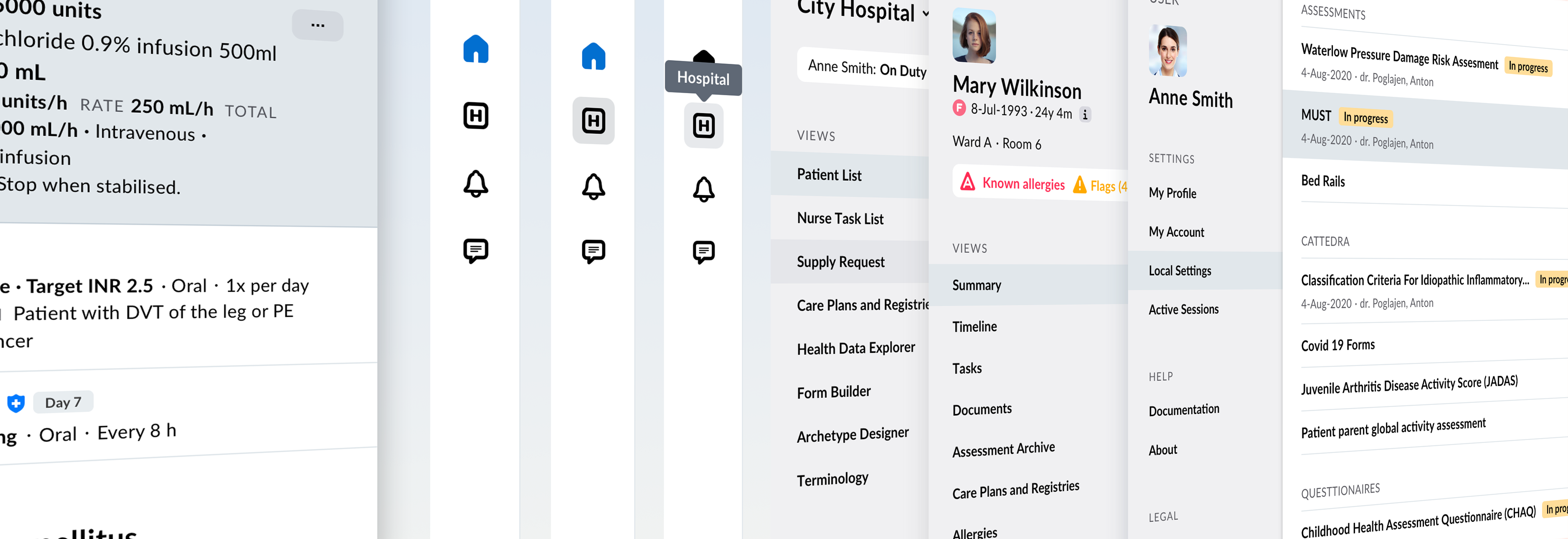
In healthcare, specialisation is crucial, and each healthcare worker needs specific tools to perform their job effectively, requiring significant customisation (a unique aspect of the industry). Although digital tools in principle allow customisation, in practice this proves to cause too many issues. Everything is too complex, the development, maintenance, training, plus numerous interface versions combined with the need for rigorous patient data access control can also be dangerous.
The user interface screens at both the organisational and personal levels are dependent on various parameters and statuses such as rules, roles, status, permissions, location, settings, etc. Although, the patient record data is static, the access to it is dynamic and dependent on the level of access granted. The same parameters that affect the personal level screens also apply at the organisational level.
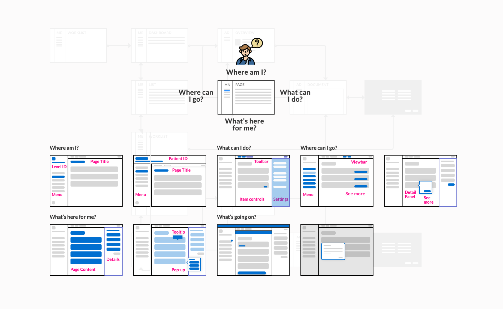
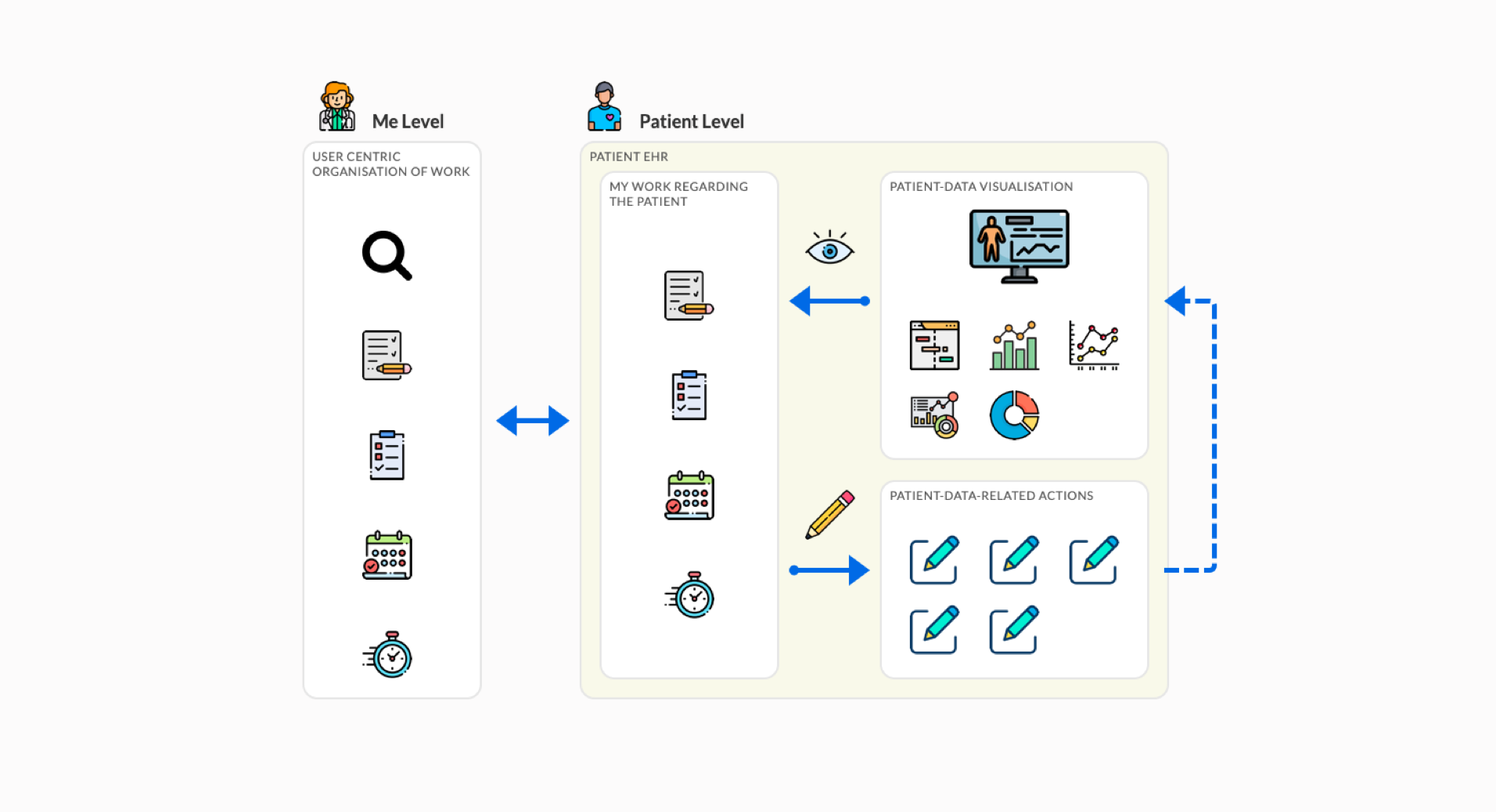
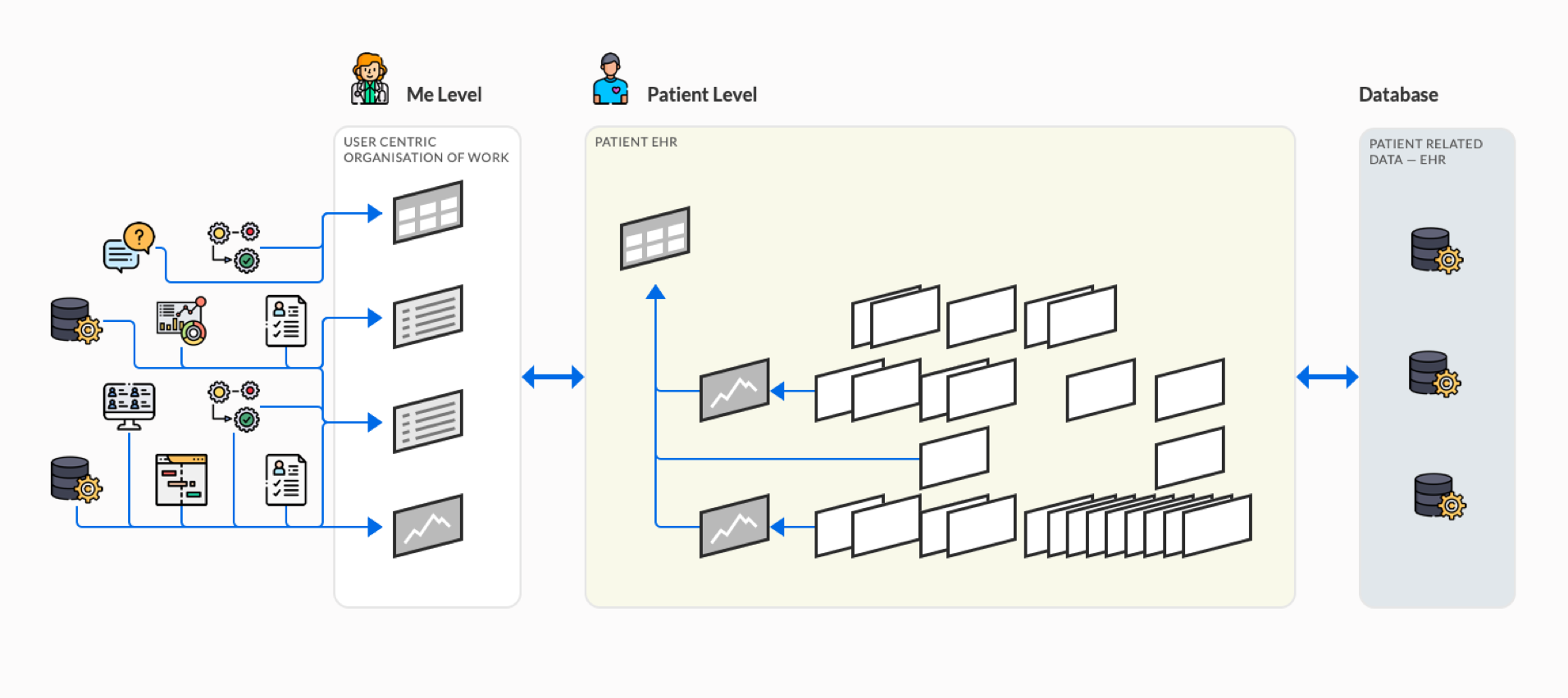
That’s why Better applications are built using modules that can be customised using a low-code tool to meet each user's specific needs. Better Portal is the one holding all these modules together. Portal’s navigation should be strong and robust to prevent chaos. To achieve a user-friendly navigable interface, we are now addressing basic navigation questions such as "Where am I?" and "Where can I go?"
Furthermore, our approach is to organise the patient record into a hierarchy that allows the user to navigate from general to specific information. Any additional information is revealed in context. For example, a widget on the dashboard displays the current value of a parameter and some temporal context (a trend). Clicking on the element reveals additional information or leads deeper into the record into the history of that specific measurement.
We are now in exploration phase, but we will keep you up-to-date on how the redesign is going.